Backcountry Brewing
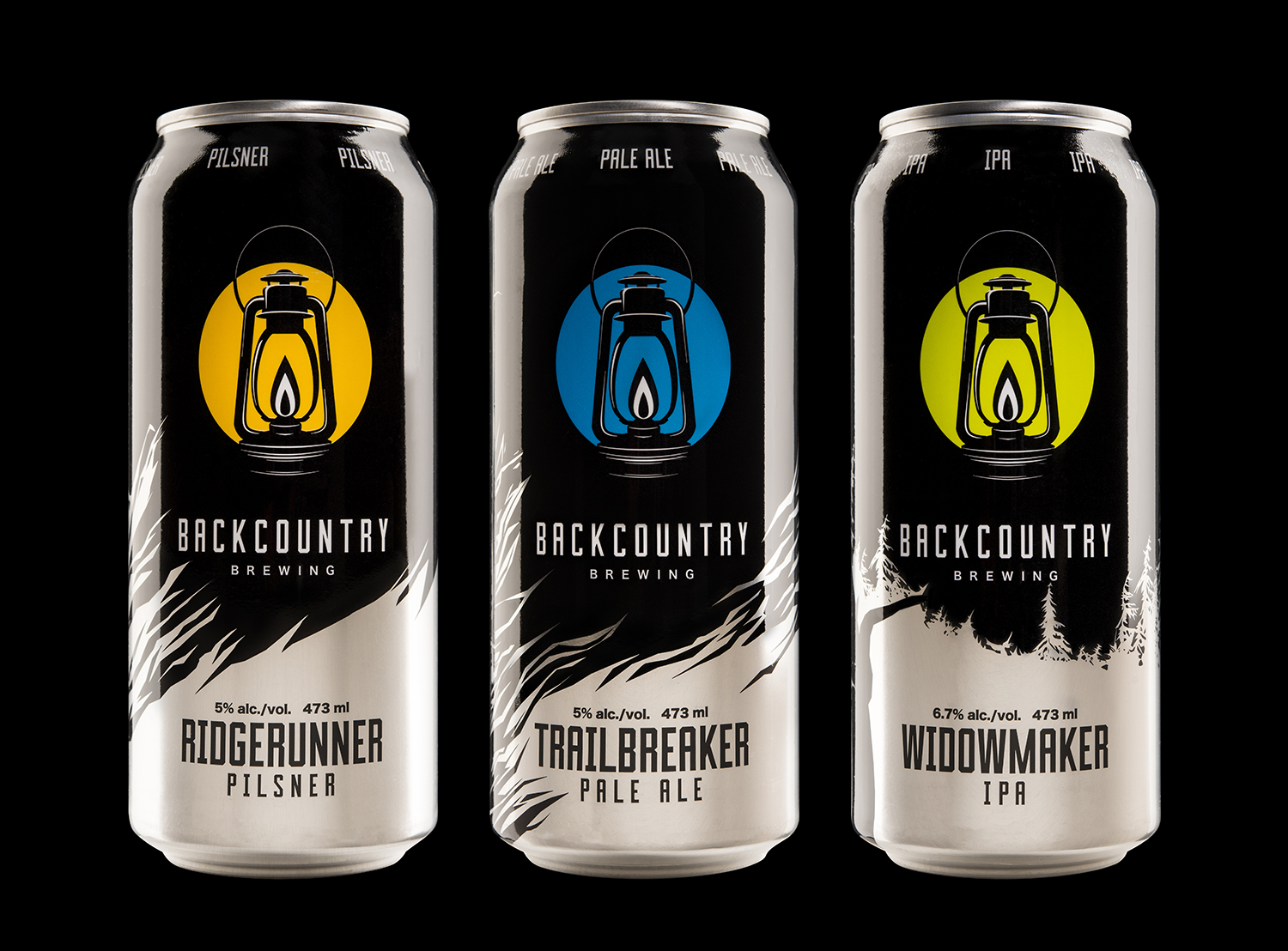
For Backcountry Brewing, a new craft brewery surrounded by the great outdoors of Squamish, BC, we were tasked with creating a lineup of cans with a hybrid approach, combining custom artwork on each can with strong unifying elements across the entire lineup.
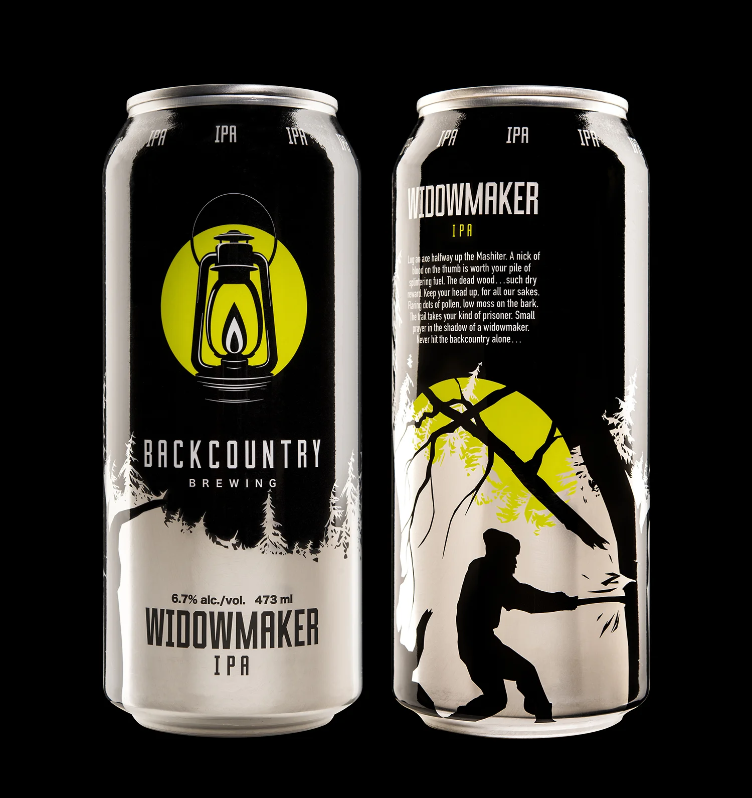
We started with a bold, graphic brandmark, illustrating a lantern in the negative space of the colourful light it’s emitting. The top and bottom of the black lantern break out of the light circle, creating a beautiful ‘disappearing edge’ that draws focus inward.
The smooth curves of the brandmark are set off by a strong, angular custom typeface, combining the rectangular counters and 45° corner cuts of Grecian wood type with modern sans-serif aesthetics.
We decided to differentiate the products mainly by the colour of the brandmark. This is a difficult technique to use successfully, and it’s a testament to the strength of the brand and the power of its negative-space design: on a black background, the lantern is always black, so the brandmark feels more consistent across the lineup.
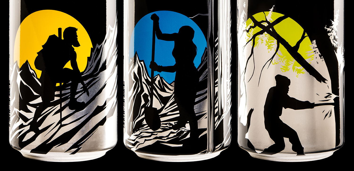
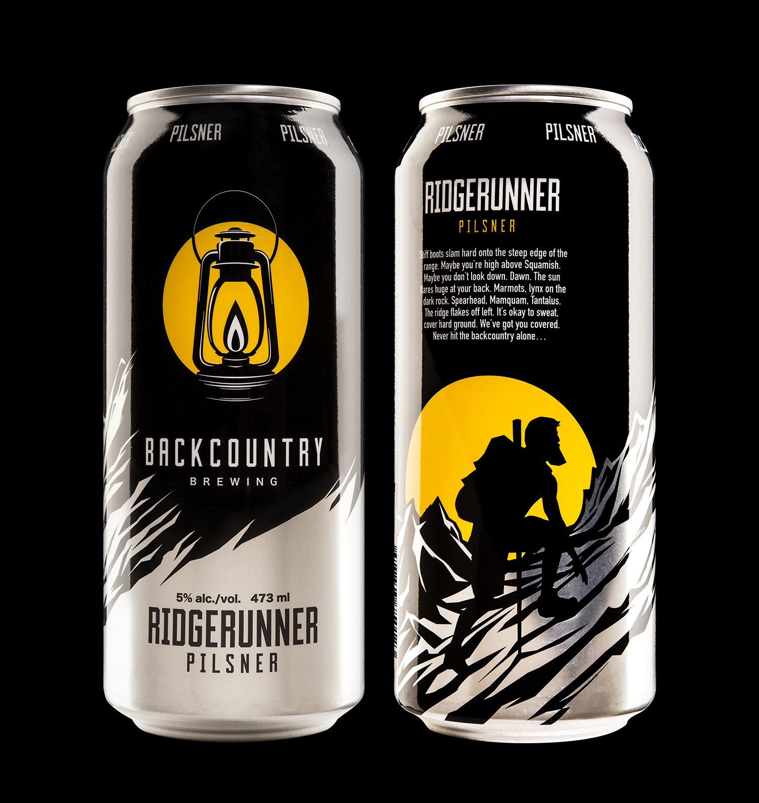
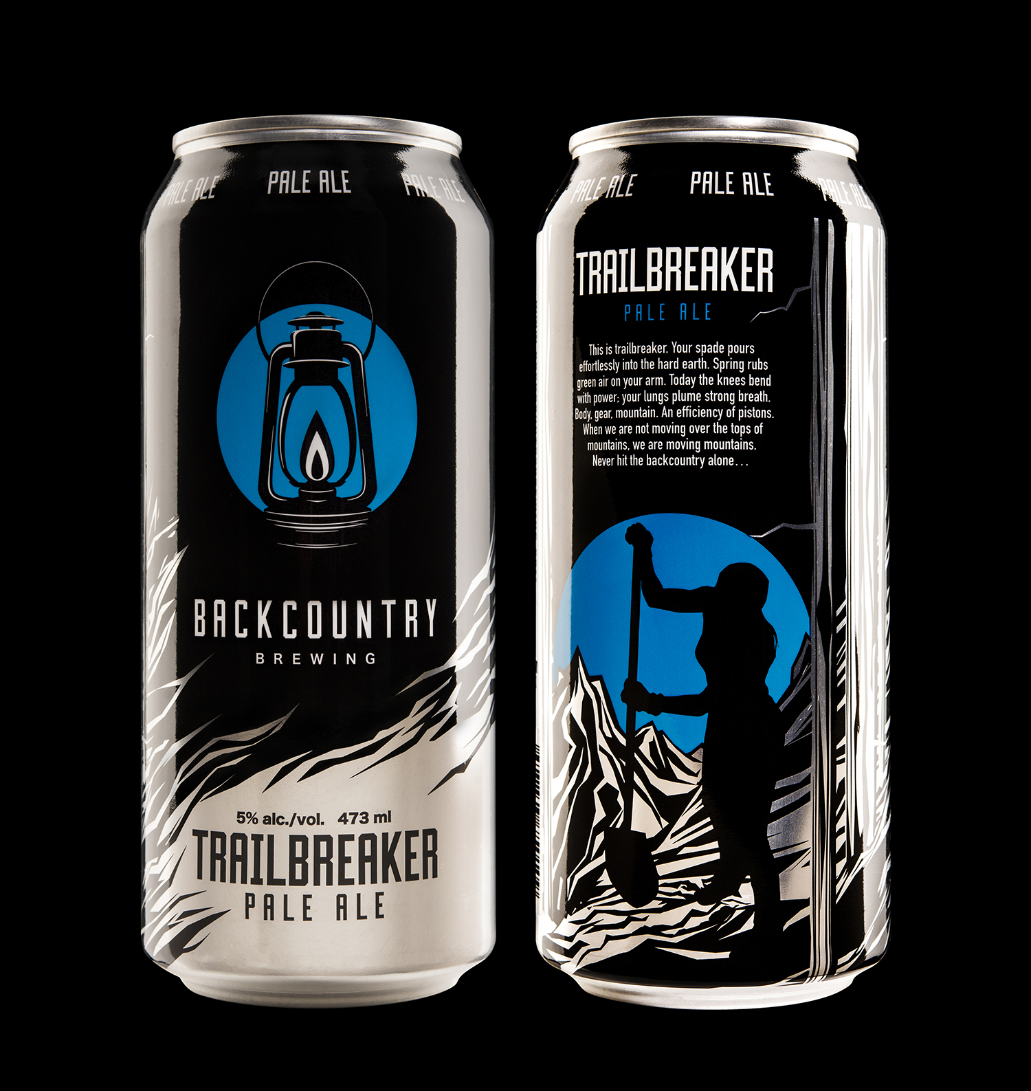
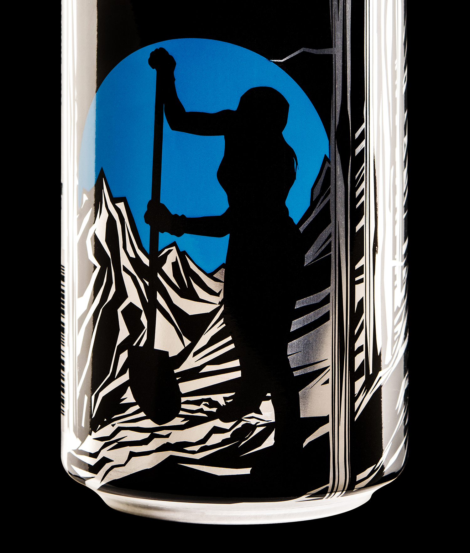
For the cans, we decided to treat the ‘back’ as an alternate front, using the colourful circle to light up illustrations of people in the backcountry, rendered in silhouette to match the bold, graphic approach of the brand, as well as to echo the lantern’s light/dark themes. The silver of the can also catches the eye without adding any chroma to our extremely tight colour design, wrapping around the bottom of the can for a textural two-tone effect.
This project also included a custom typeface design so the brewery can extend the look and feel of their packaging to all their other marketing materials.
