Mill Street Brewing
In every town, there is a Mill Street. It is the cornerstone to any settlement. It brought life and sustenance. It formed communities. It created cities. Before a Main Street or a Park Street, there was Mill Street.
Mill Street Brewery is an iconic Canadian brewery based in Toronto’s historic Distillery District. When it opened in 2002 it was the first commercial micro-brewery to see those old cobblestone streets in over 100 years. Today, Mill Street boasts six brewpubs across the country, and between their main brewery and the brewpubs they brew more than 150 unique beers every year. They’ve won Canadian Brewery of the Year at the Canadian Beer Awards three times in a row and took home six World Beer Awards gold medals this year alone.
Mill Street turned to Hired Guns Creative for a rebrand in the fall of 2017. Our challenge was to take a brewery who had grown far beyond their humble origins and redevelop their designs in a way that better told their unique story, all while keeping them connected to their Canadian roots.

CORE LINEUP
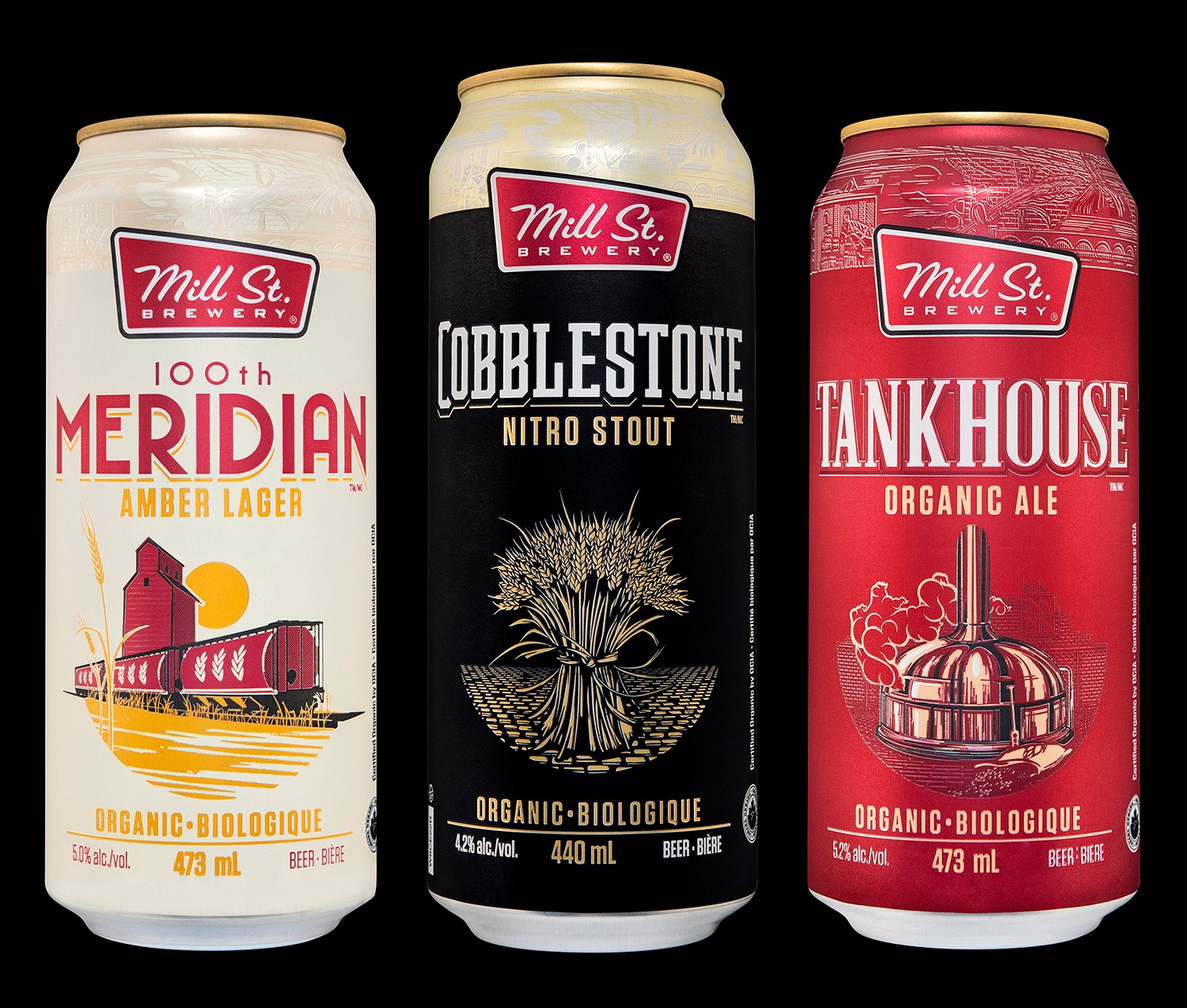
If there’s one word that epitomizes the overall Mill Street brand, it’s “organic.” Since their beginnings in 2002, Mill Street brewed organic beer—their Original Organic Lager represents the first certified organic beer in Ontario. As of 2018 the rest of their core brews – 100th Meridian Amber Lager, Tankhouse Ale, and Cobblestone Nitro Stout – have followed suit; all four beers are now certified organic.
Mill Street’s core beers were already well established in the marketplace, and we didn’t want to disrupt their brand positioning. We needed to balance a respect for the original designs while creating consistent narrative threads that would tell the story of the Mill Street Brand across all beers.
The new look focuses on illustrative elements inspired by the original designs, redrawn to provide more consistency across the product line. Each illustration tells the story of Mill Street’s relationship between ingredients and production with a stronger connection to a sense of place throughout.

The addition of the illustrated top band tells the tale of Toronto’s brewing history from the 1800s to the present day—it’s a narrative arc that places Mill Street in Canada’s brewing history while connecting them to the current state of Canadian craft beer. This band runs along the top of all of the cans and secondary packaging (4-packs, 12-packs, etc.) in colours appropriate to the colour scheme of each product.

100th Meridian, Cobblestone, and Tankhouse represent an eastward journey, from the great plains of Alberta to Toronto’s distillery district. The strong silhouettes and bottom curve of the ovals are a callback to vintage design elements, a thread connecting Mill Street to the past. The refined colour palette is drawn from the original artwork, reimagined to create consistency within the brand.
The similar design styles and common colour palette might have led to a homogeny in the design, so we created some custom typographic elements to break apart the beers, giving each a distinct voice within the tight brand system.
Our common colour palette and design narrative helps Mill Street’s organic lineup stand out as distinct while showcasing the shared story of Mill Street’s relationship with organic ingredients and craft production within their brand.

CORE BEERS
100th Meridian
100th Meridian Amber Lager features ample use of open space, futurist typographic elements, and a clean colour palette representing vast fields of grain.

Cobblestone
Cobblestone Nitro Stout utilizes the iconic barley sheaf from the original design nested among eponymous cobblestones of the distillery district. In this design, the custom slab serif typeface takes on a stone-like appearance.

Tankhouse
The entirely new design for Tankhouse Organic Ale replaces the old barrel and brown label with a steam-spewing tank, utilizing copper and gold with the Mill Street red. The custom typeface is a traditional serif with decorative outlines and drop shadows.
