Monashee Spirits
For Monashee Spirits, a new distillery amid the intense mountains of Revelstoke, BC, we were tasked with creating branding and labels that feel classic and playful, while communicating the giant scale of the local landscape.

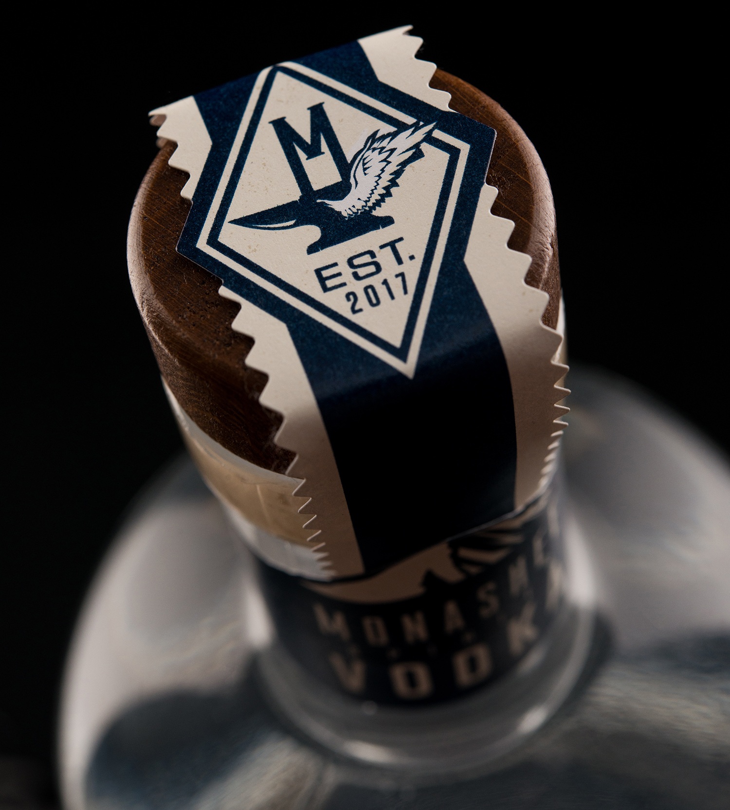
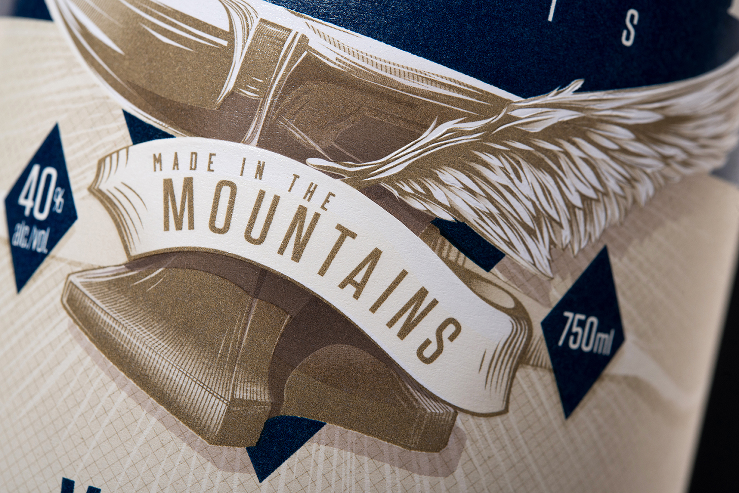
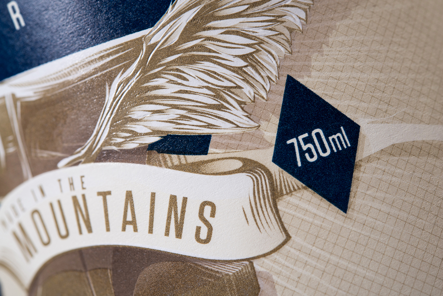
We decided to focus on the image of a flying anvil, a juxtaposition of heavy and light. The anvil embodies the bold, handcrafted spirit of the company’s “Made in the Mountains” tagline, while the wings lend a light-hearted twist and a nod to Revelstoke’s elevation. The strength of the image allowed us to build two versions of the brandmark: the first rendering is highly detailed and three-dimensional, perfect for the centrepiece of a large paper label; while the second is distilled to its essence for limited colour spaces or smaller contexts.

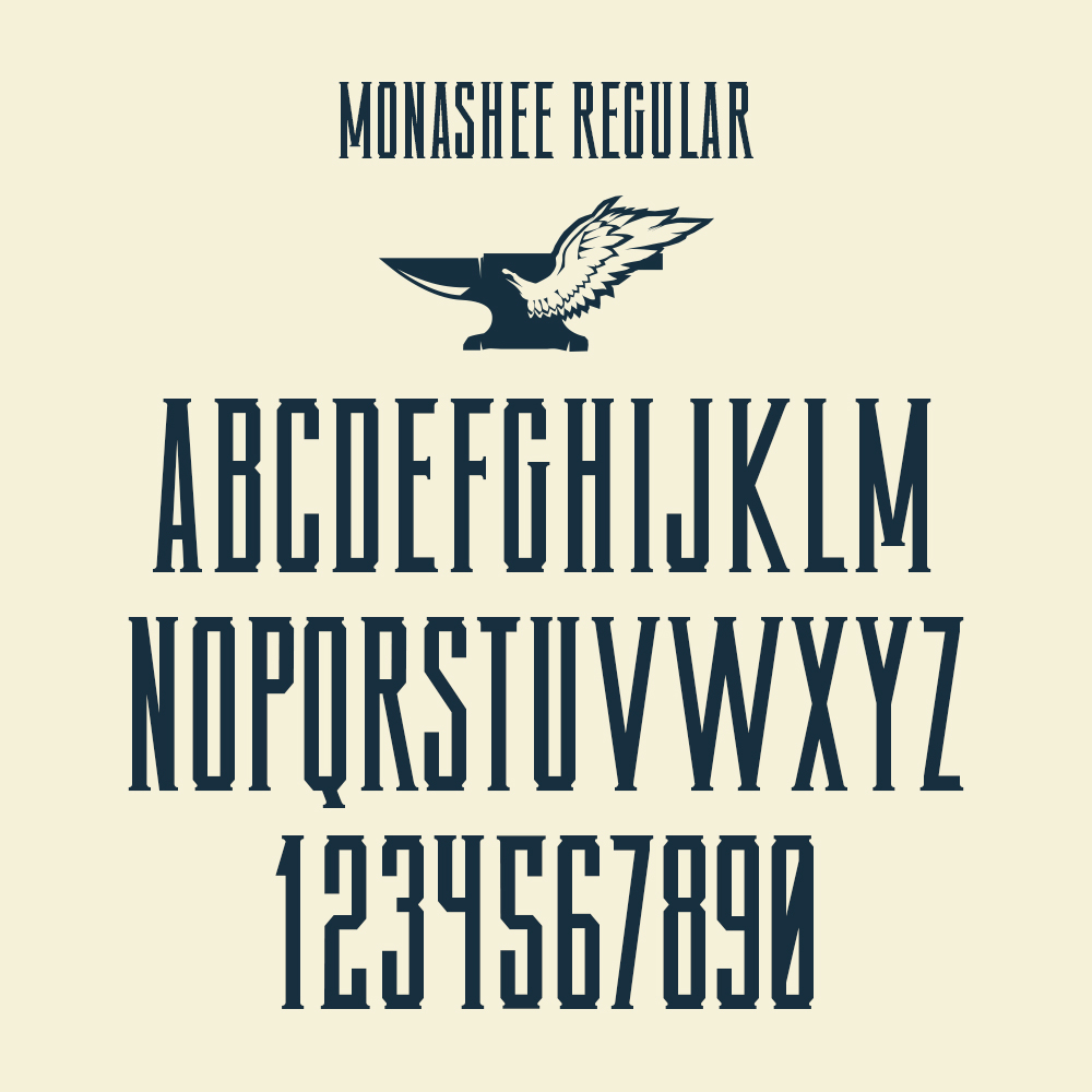
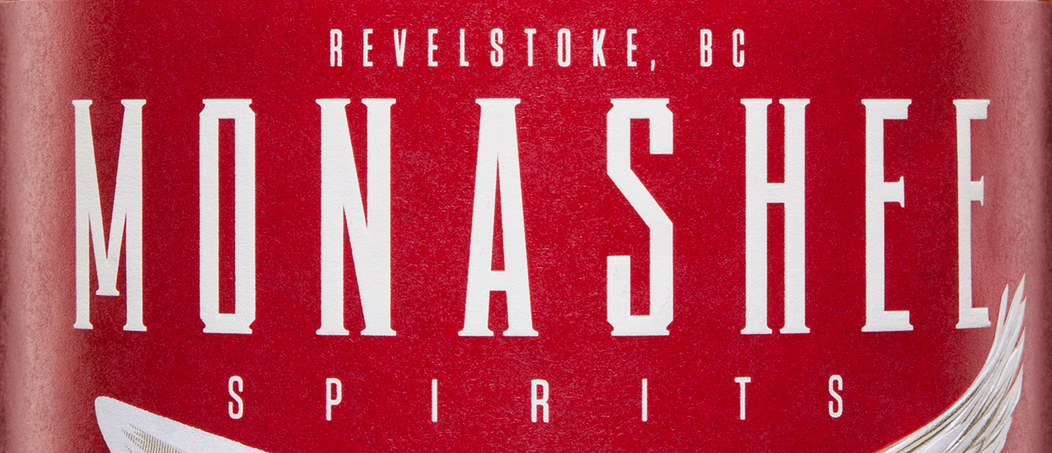
For the “MONASHEE” typography, we created custom letterforms with an elegant upright stance and sharp angles set off by serifs that echo the base of the anvil.
We designed the lineup using a shared palette of sepia tones contrasting with a bold shot of colour to differentiate each product.
The diamond shape forms a motif that’s carried throughout, from the legal info to the background to the top of the stopper, as well as the decorative edges on the cap strap and neck strap that tie it all together.


This project also included a custom typeface design so the distillery can extend the look and feel of their packaging to all their other marketing materials.