Railyard Brewing
Action on the tracks. An inbound train with freight cars full of hops and grain. The crew comes alive. Their shadows too – blurred figures taking advantage of the layup, laying down spraypaint end to end. This is the place, the junction of art and harvest. This is Railyard Brewing.
For Railyard Brewing, a new craft brewery in Calgary, Alberta, we were tasked with coming up with a name and concept that expresses the team’s love of street art while maintaining strong local roots. We decided on the classic image of spray-painted freight cars, iconic in the world of graffiti, and historically significant to Albertans, especially for growers and brewers.
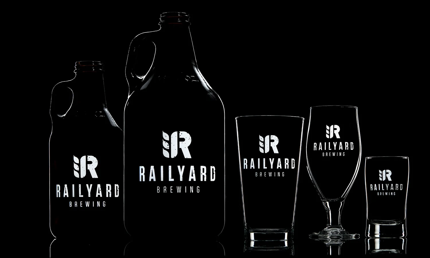
We chose the name Railyard for its strength and simplicity, and created a bold monogram, a stencil-style “R” reminiscent of stylized wheat logos on old grain cars.
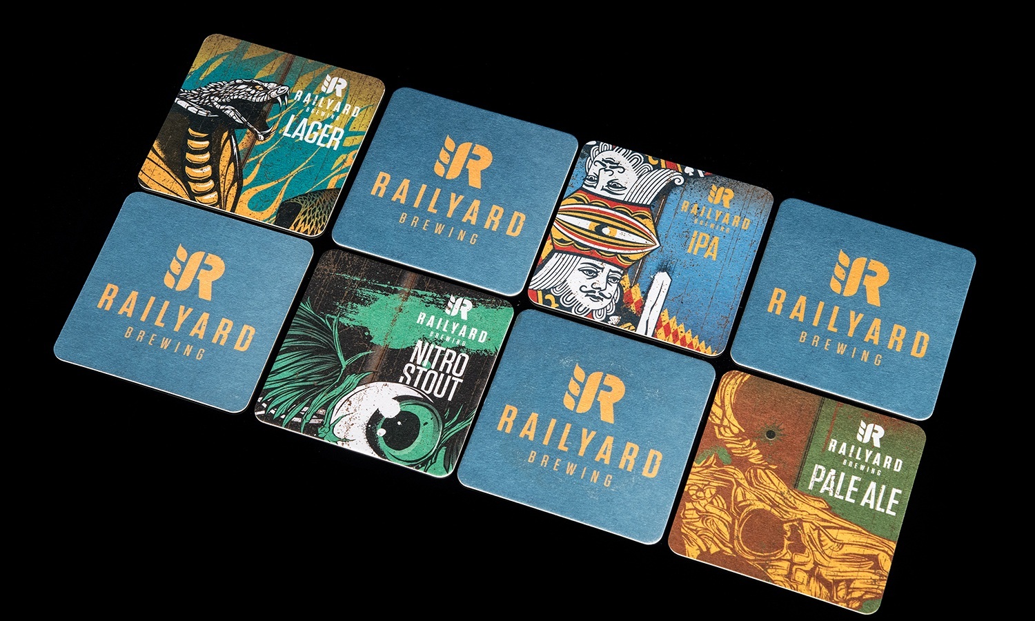
To communicate the overall brand concept clearly and give it the right feel, we decided to separate the brand world into two layers: the first, a strong, no-nonsense brand mark that would look great on the side of a train; and the second, a layer of playful, imaginative artwork painted over the train and the corporate brand.
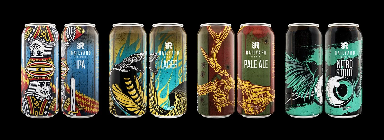
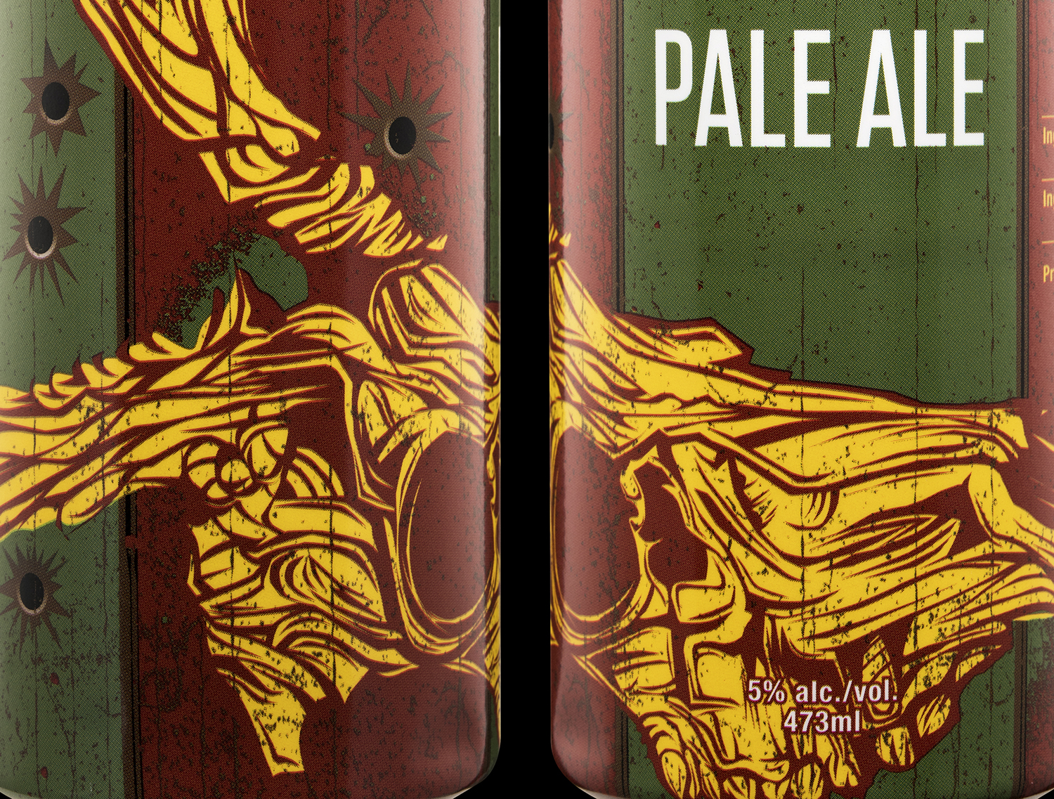
For the cans, we laid down our illustrations from end to end with vibrant colours in a highly-textured graphic style. The strength of the core concept freed us up to work with a wide range of subject matter, from playing card kings to king cobras — from flying eyeballs to buckshot and deer skulls.
Printed Collateral and Merchandise:
Animation:
For a fun little experiment we wanted to see what it would look like if the cans we designed for Railyard Brewing were animated. We started with their Lager - let us know what you think of the results.
Recognition:
Related Work:
Check out our ever-expanding collection of seasonal releases designed for Railyard Brewing.


