Short Fuse Brewing
For Short Fuse Brewing of Chicago we were tasked with creating an identity that would showcase the brand’s impressive lineup of barrel-aged, wild sour and traditional beers, ultimately disrupting the Chicago craft beer scene with a bright, bold identity and a dynamic vintage colour palette.
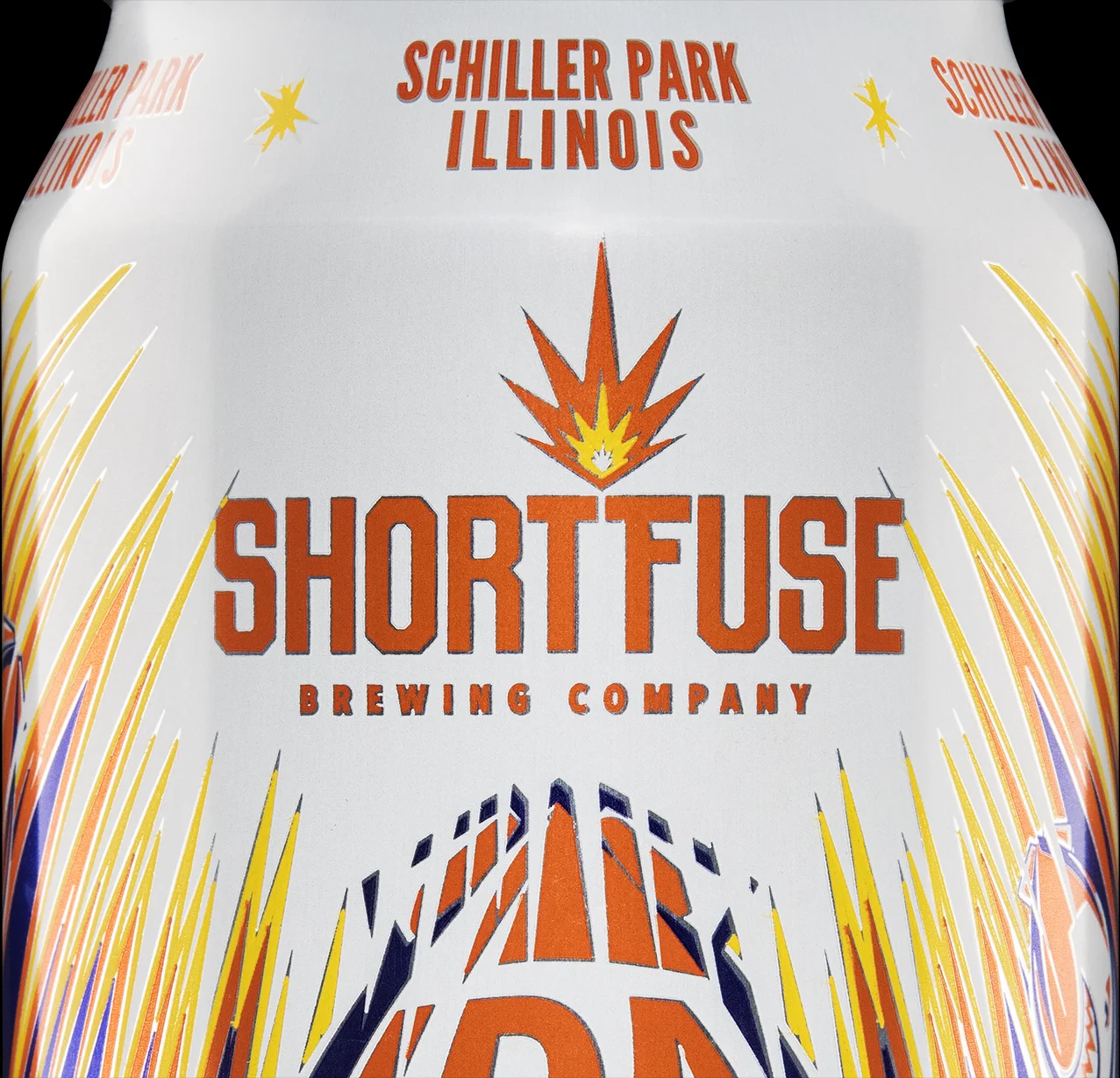
The Short Fuse palette was developed after an exhaustive examination of mid-20th-century illustrated fireworks packaging. It features time-worn and muted backgrounds juxtaposed with explosive images and bright colours that explode off the shelf.
A close inspection of the logo’s negative space reveals a mind-blowing secret, a reward for customers taking the time to look deeper.
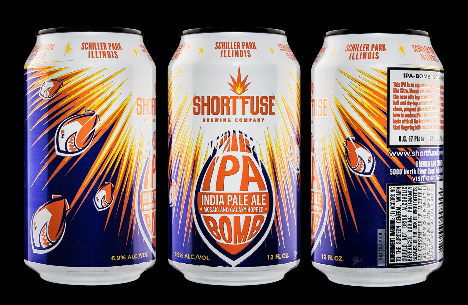
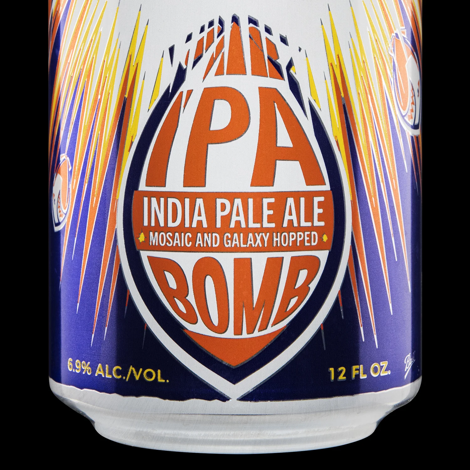
The custom packaging we designed for Short Fuse's IPA Bomb draws on the bombastic primary colours and explosive imagery featured in their earlier labels. The convex illustrative lettering along the can’s front gives the sense that the key image, a fat bomb, is bursting—a megaton explosion of flavour about to descend onto customers’ taste buds.
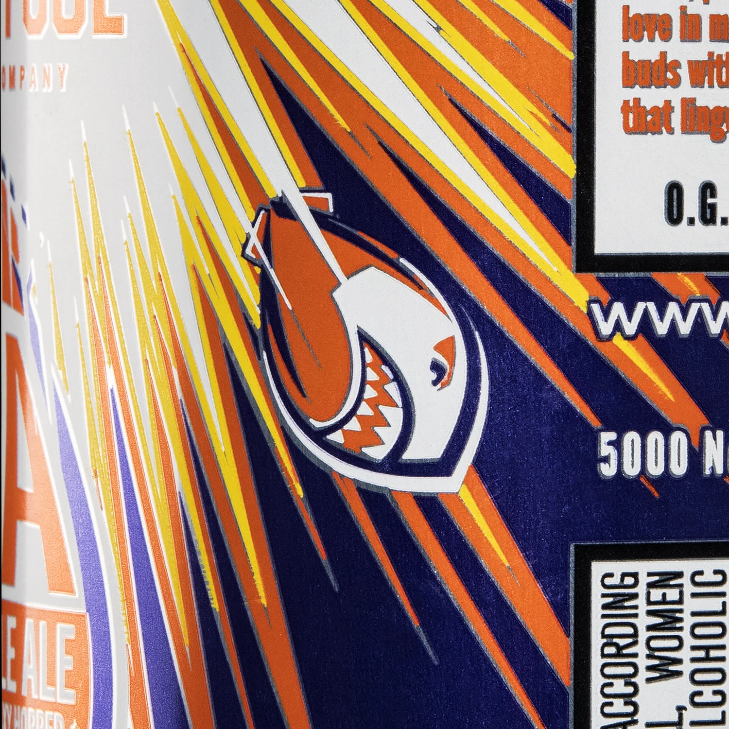
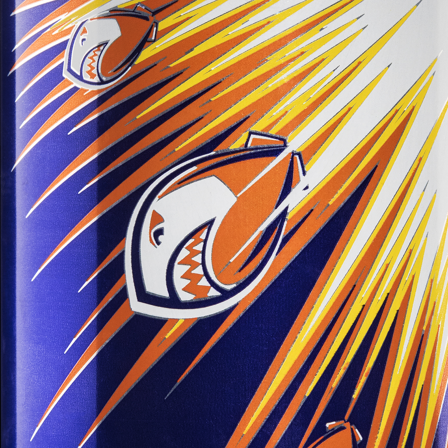
The can artwork details feature small bombs breaking out of the central blast imagery, each bomb emblazoned with shark teeth nose art made famous by America’s Flying Tiger squadron.
The development of the brewery’s business model challenged us to adapt, to develop a flexible identity for a start-up brewery with a diverse, ever-changing and expanding lineup, to build a brand that could contain the brewery’s traditional labels and an expanding line of custom designs.
We’ve included a snapshot of just a few of the 35+ templated labels we have designed for Short Fuse since they opened. After testing all of their beers in their tap room the brewery decides which ones to promote to a larger production run and then requests custom packaging design. Their IPA Bomb started out like all of their beers and rose through the ranks to become their first fully-custom can design.


