Wayfinder Pale Ale
Getting lost on the trail with an old friend – there’s nothing better. The air is clean and crisp under the forest canopy, golden light filtering through the lacework of leaves. A glacial cascade joins and flows with the river. You pause at a fork in the path. There’s something familiar about the plants, the wildlife. Tiger lilies stalk the trailside, a hint of sweet orange peel in the air. A whiskeyjack takes flight. You know the way.

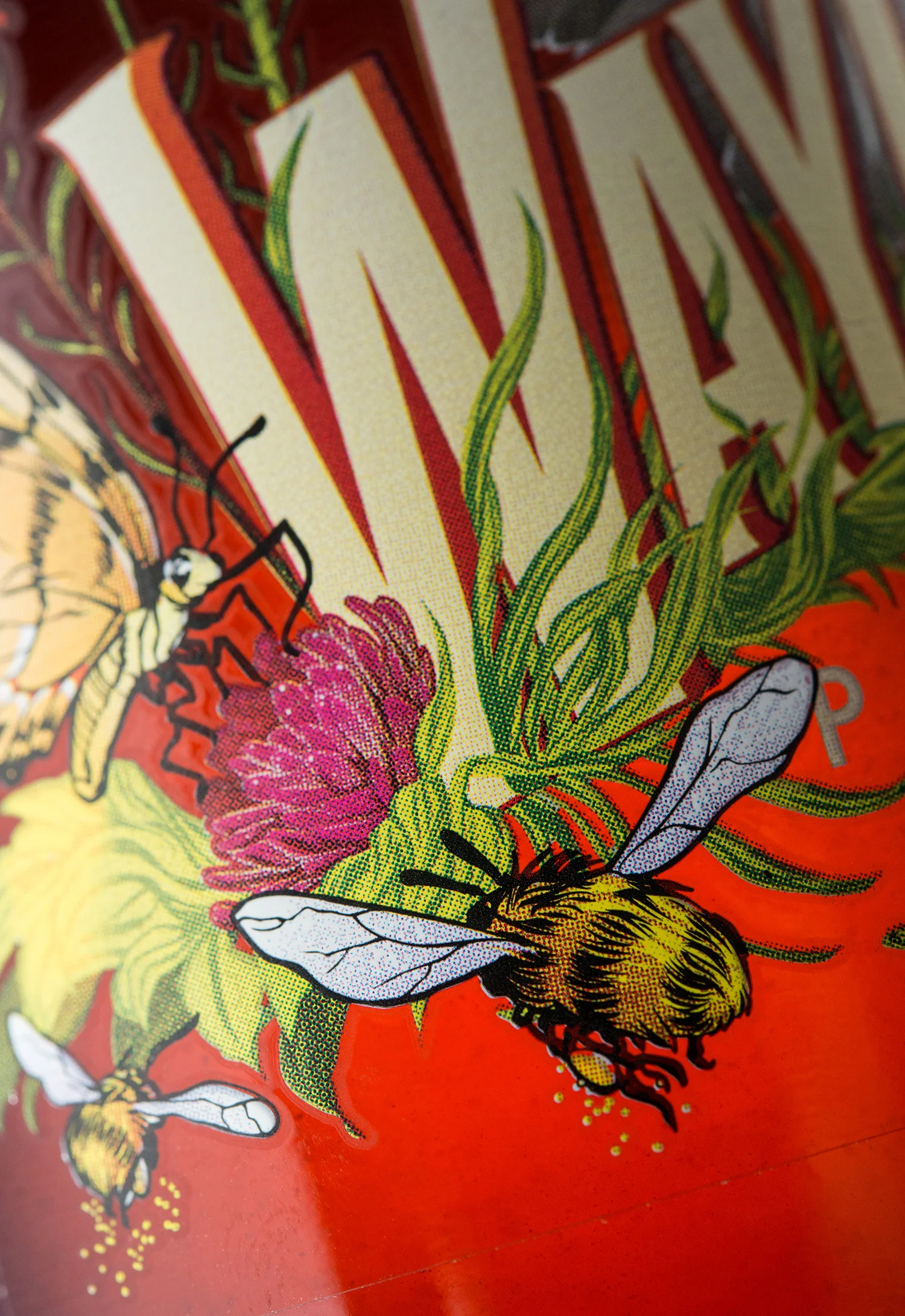
For Big Rock Brewery’s first Pale Ale brewed at their new Vancouver location, we decided to pay homage to the beautiful West Coast outdoors with a name and visual brand that place the beer amid coastal alpine flora and fauna. We pushed Wayfinder into new printing territory, using full colour and transparency to throw individual blades of grass and bits of bee pollen into relief against the beer itself, merging beer and brand in an unprecedented way.


This simple animation shows the four stages that the Wayfinder label design went through: ink & paper sketch, vectorization, colourization, and the printed label applied to the bottle:
