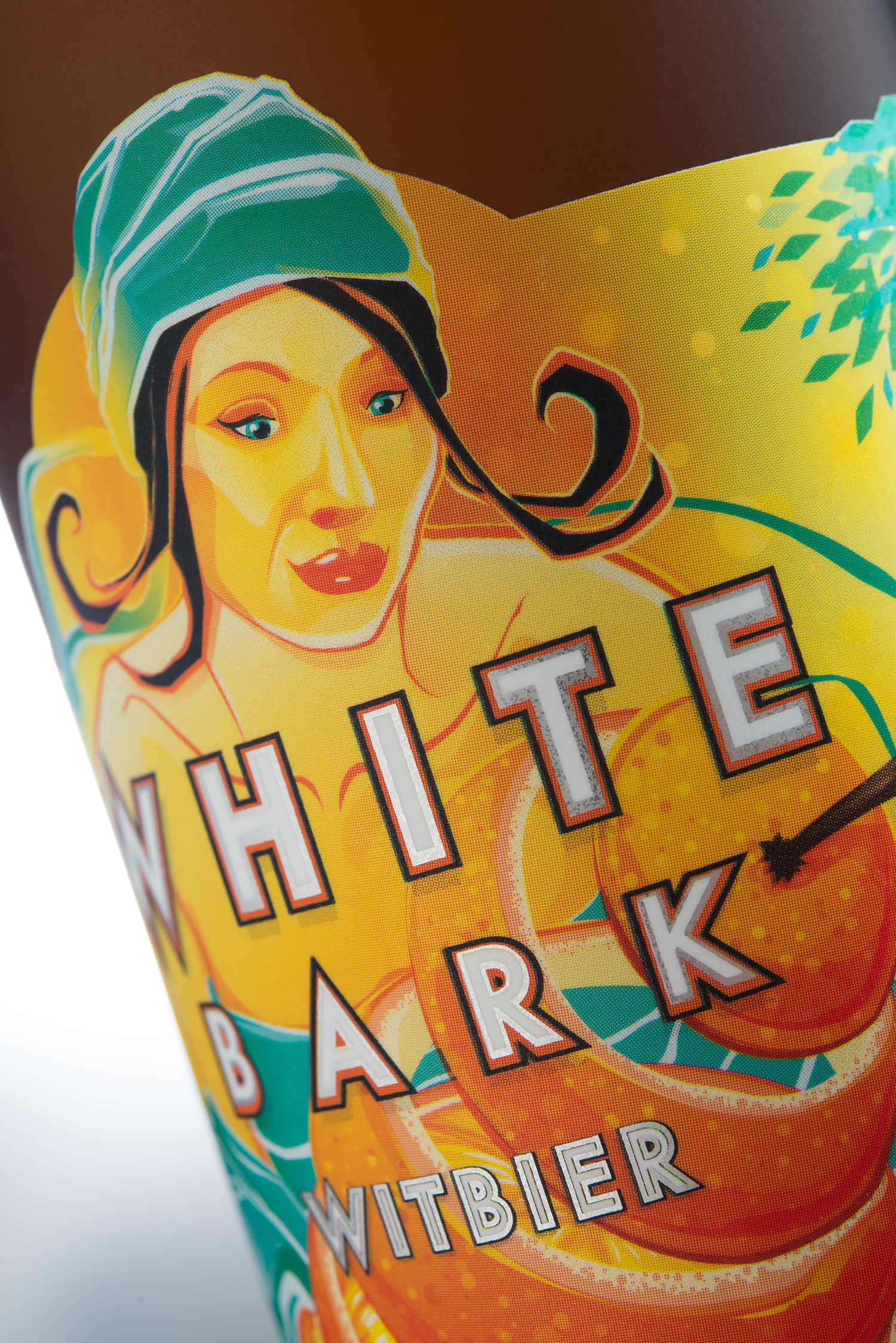
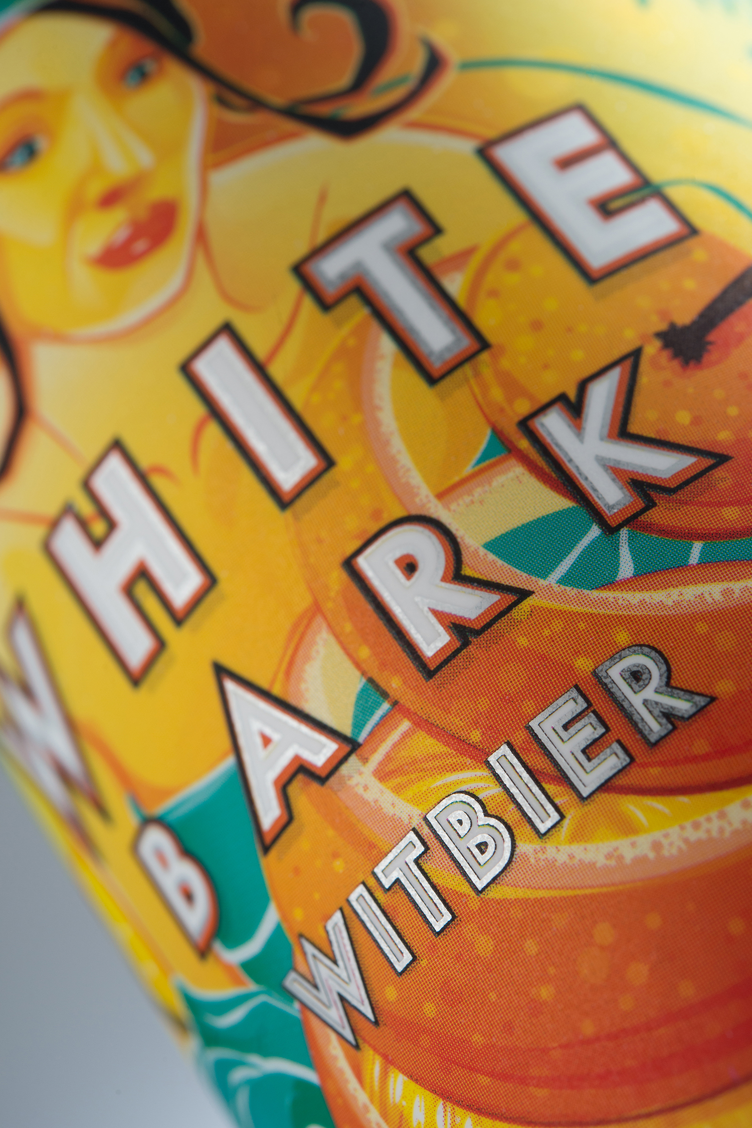
White Bark Witbier

For the redesign of Driftwood Brewery’s White Bark Witbier label we focused on evoking an image of intense summer in some undefined, rural part of southern Europe, where citrus groves abound, trips to the market are a regular occurrence, and slow living isn’t a buzz-word but the way things have always been.

The bridge between the succulent interior of a citrus fruit and the bitter oil that protects it is the pith, the white bark that marries the two solitudes. A perfect harmony of citric bitterness, fragrant coriander, round malt and raw wheat.


Poster Design:

Box:

Recognition:
Related Work:
Click any can or bottle to see the other packaging that we’ve designed for Driftwood Brewing.
