Whitetooth Brewing
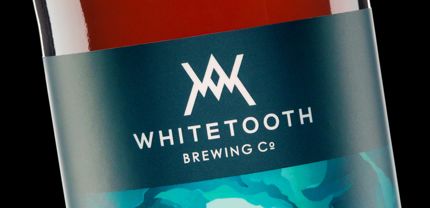
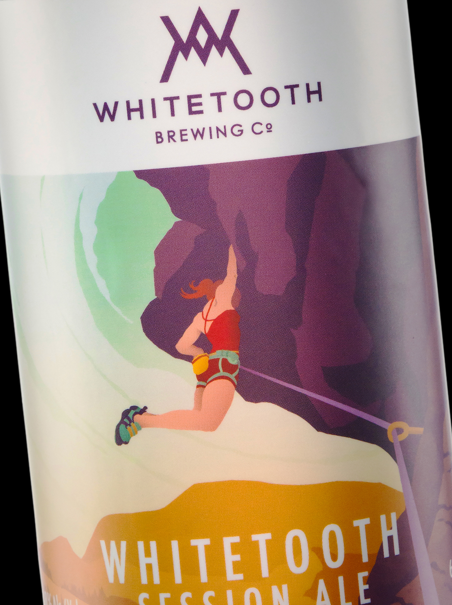
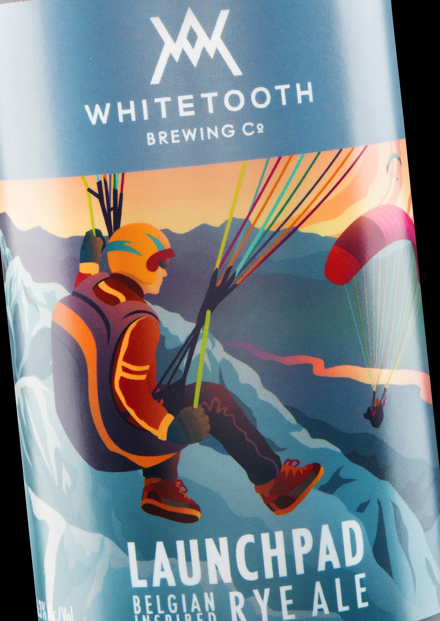
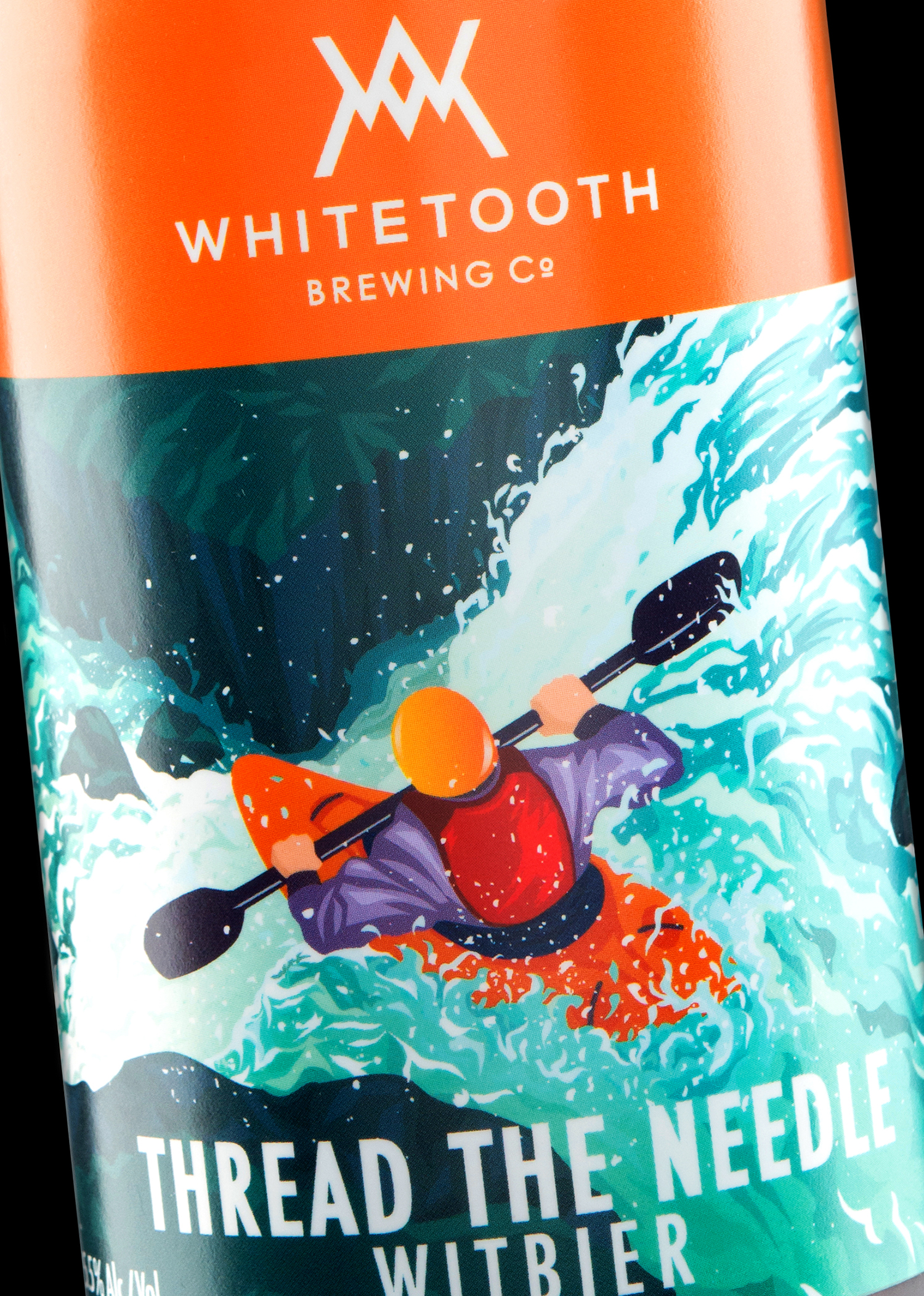
For Whitetooth Brewing, named after the local historic ski resort in Golden, BC, we decided to create a logo inspired by outdoor adventure gear and Swiss Style design. The brandmark, composed with the monogram “W” as part of an abstract set of teeth, also yields an iconic “black diamond” in its negative space.


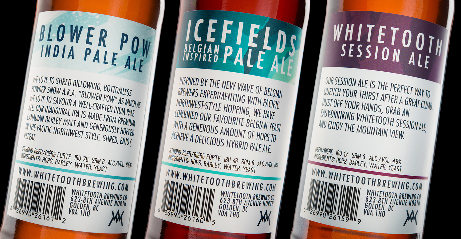
Referencing classic National Parks posters and outdoor adventure photography, we developed a hybrid label system with a minimum of design container elements, relying on the strength of the illustration style and composition for high brand recognition amongst individual labels, each designed to flavour.
Cohesion within the illustrations was achieved with the use of dynamic figures at medium distance with semi-obscured faces, allowing the viewer to place themselves right up in the action.
Bold colour combinations and striking outdoor scenes — imbued with WPA poster-esque expanses of snow, water, sky, dirt and cliffs — give the prospective drinker an idea of each brew’s palate and personality.
Beloved landmarks and a variety of seasons and terrains were represented in the illustrations to express the abundance found in Golden and its surrounds, connecting Whitetooth beer drinkers (whether they be locals or visitors from far-flung places) with the heady adrenaline rush and sense of awe felt by those who engage in extreme sports in the vast Canadian wilderness.