Enrico Winery

Enrico Winery is a new winery located in Vancouver Island’s Mill Bay. They came to Hired Guns Creative in the spring of 2010 for a full branding package and label design for their first vintage, which was released that summer.
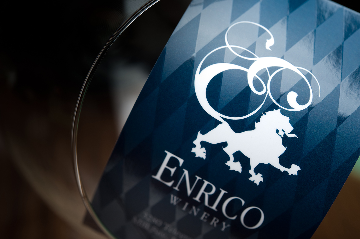
The owner of the winery had two firm criteria for the branding: it had to incorporate imagery of a lion and it had to convey a regal feeling. Given these constraints, Richard felt that the best approach would be to create a logo in an illustrated, pen & ink style, rather than something more trendy. The logo also needed to work at various sizes: everything from the top of a wine bottle cap all the way up to a six-foot-tall road sign.
The labels were designed to be stately and evocative of majestic halls with glorious tapestries. They feature a custom die-cut shape and hand-applied cap straps.


The business cards for Enrico Winery were designed to continue the theme of regality and majesty. They feature a spot UV varnish on the repeating diamond shape in the background of the design.