Approaches to Brand Architecture
When we look at how breweries approach their packaging design we see a spectrum.

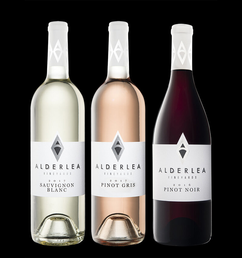
On one end there’s the RIGID TEMPLATE approach, where every product looks almost identical to every other product. Some people refer to this as the “Branded House” approach.

For each new product release you change an accent colour, change the product name, update the love story, and you’re good to go.
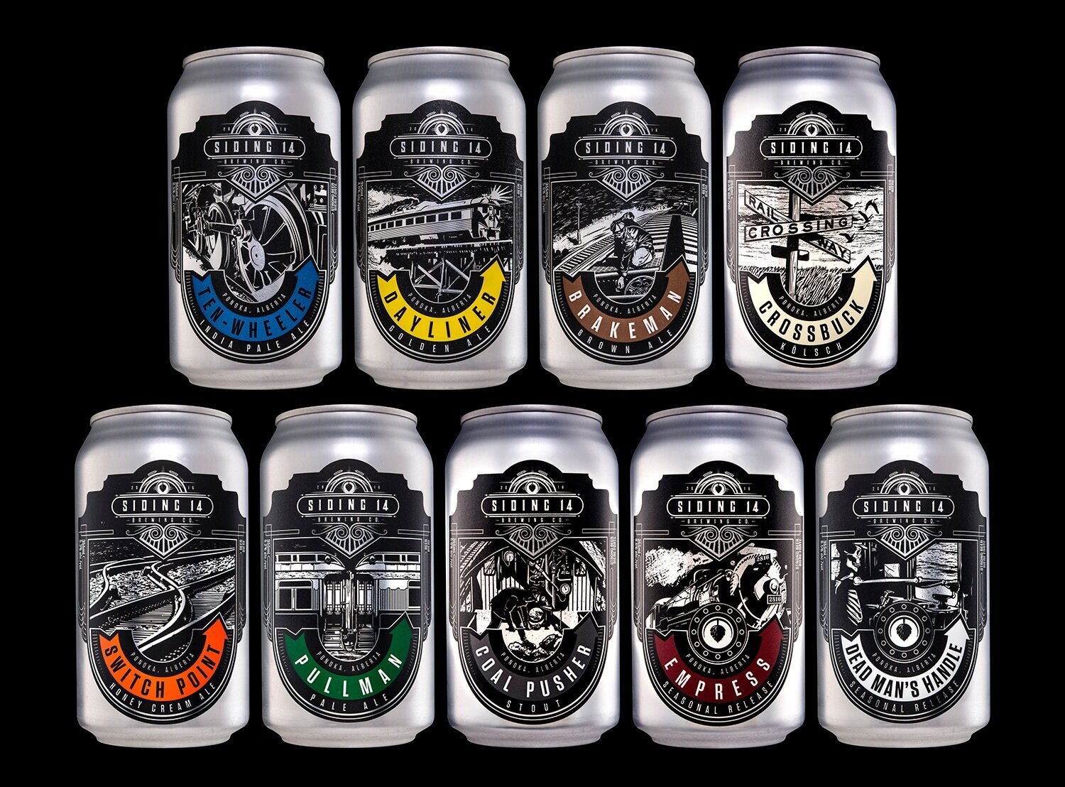
RIGID TEMPLATE Approach:
consistent layout
consistent illustration
consistent typography
customized accent colours
(Click any of the images to see the full project.)
The RIGID TEMPLATE approach makes it quick, easy, and cheap to roll out new products. And it provides the ultimate in Brand Blocking when you have multiple products together on a retail shelf. Wineries often favour this approach.
But if you have too many products it can become hard to tell them apart from each other. Also, you start to run into the “Rainbow Problem,” where you’ve used so many colours that you now have three products with slightly different shades of teal for their accent colours.
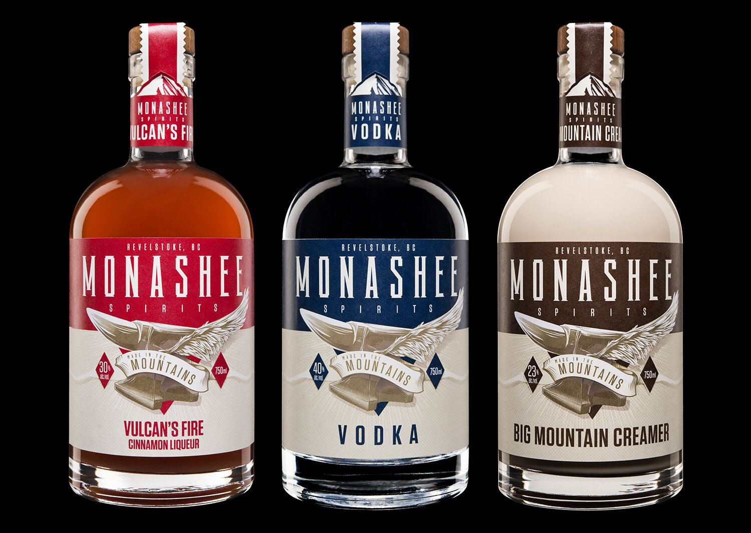
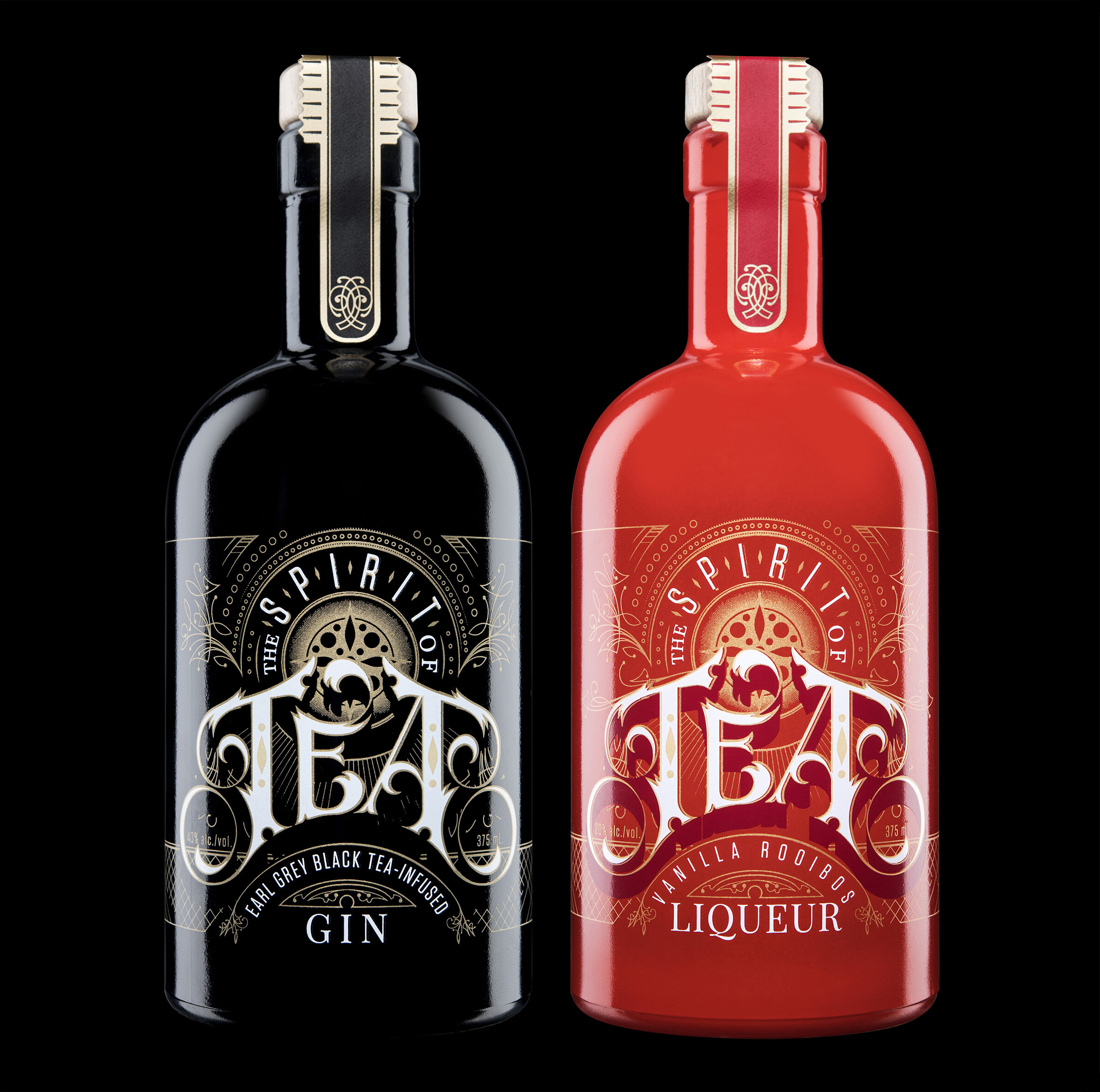
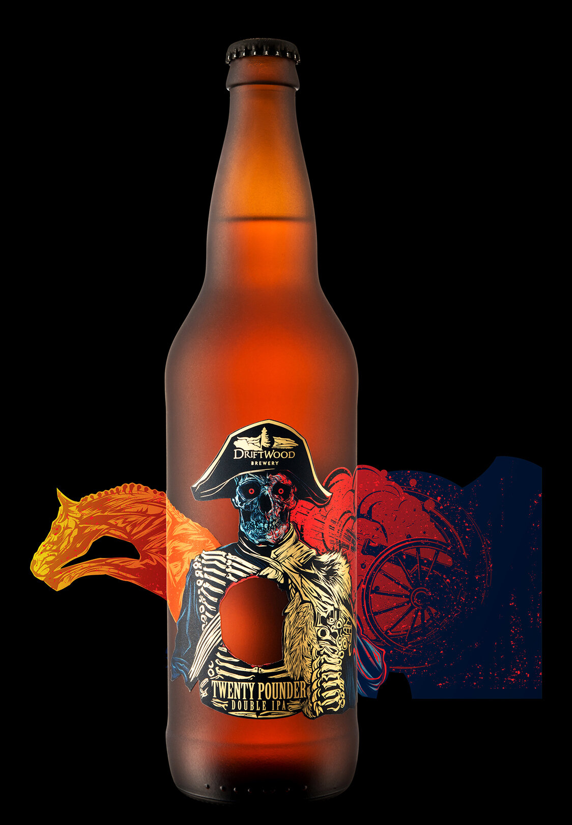
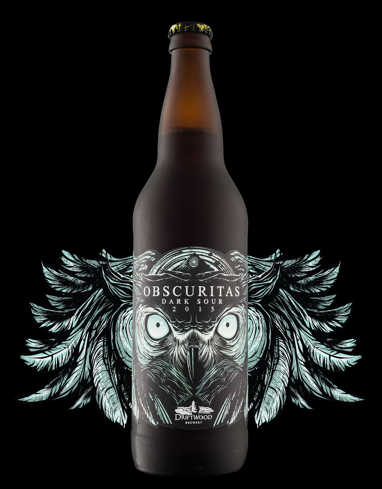
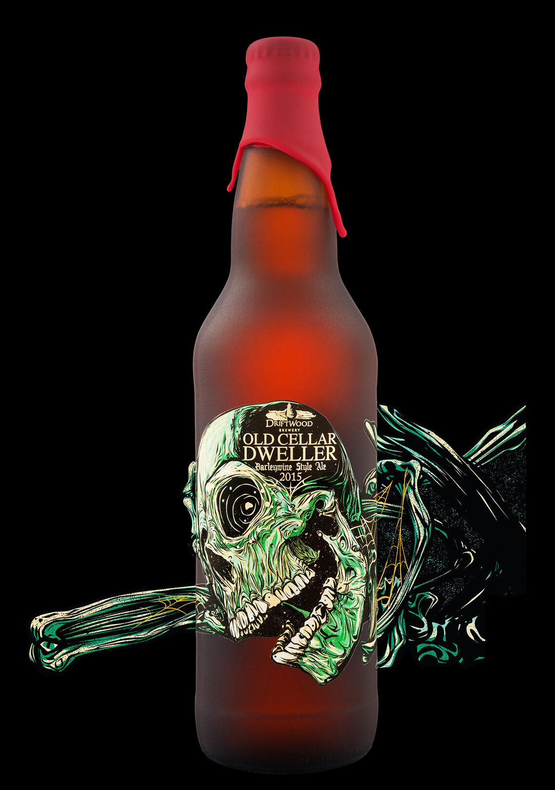
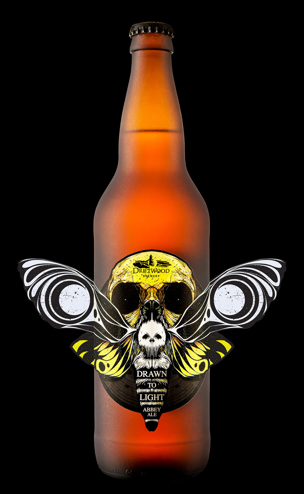
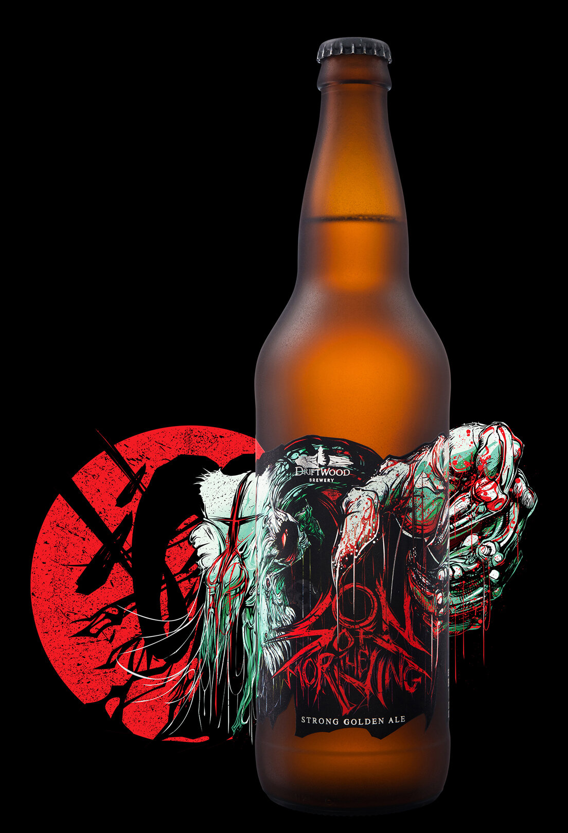
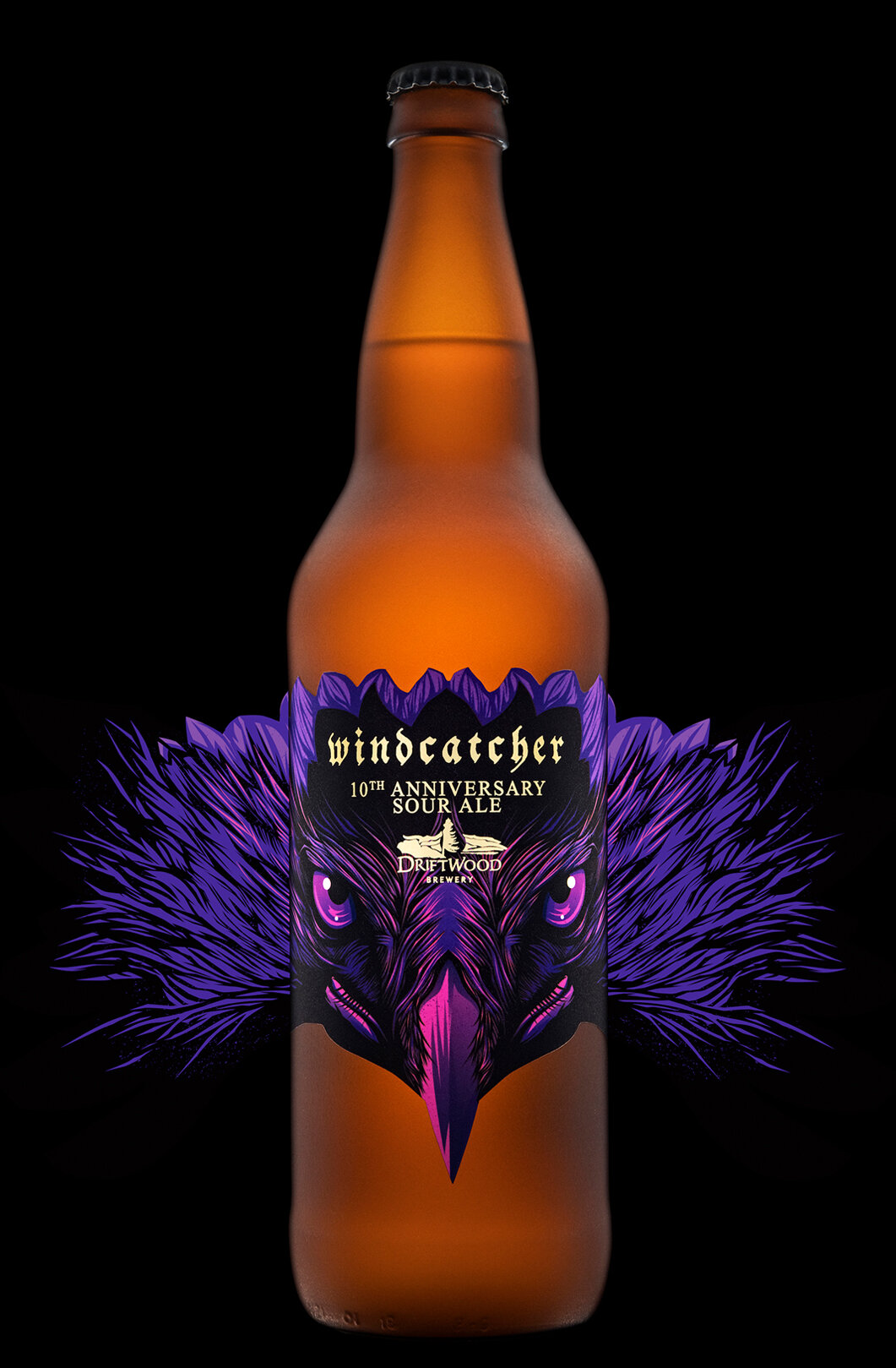
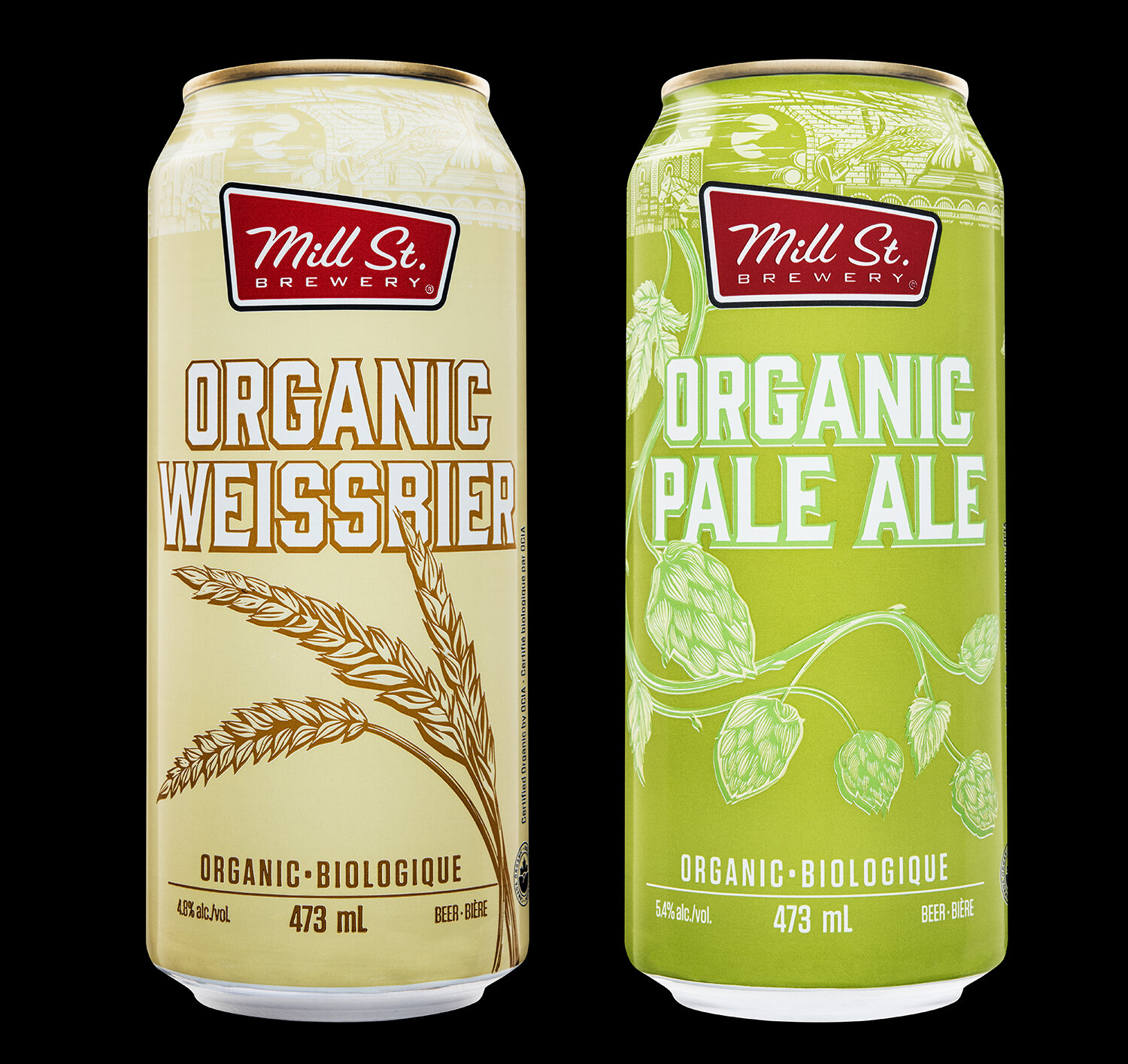
On the other end of the spectrum we see the FULLY CUSTOM approach, where each product is completely different from every other product. Some people refer to this as the “House of Brands” approach.

With this approach you’re able to completely customize the packaging design of each product to best represent the liquid inside the container. This can be quite powerful. But this approach takes longer, it’s more difficult, and it costs more than any other approach.
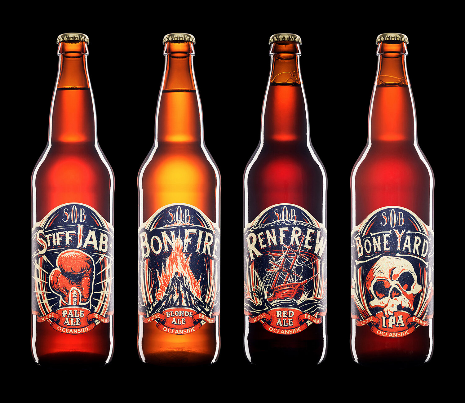
FULLY CUSTOM Approach:
consistent corporate branding
custom typography
custom illustration
custom layout
custom die-cut shapes
custom colour schemes
(Click any of the images to see the full project.)
One thing to watch out for when using the FULLY CUSTOM approach is that the “Ambassador Brand” (your brewery’s brand) can get lost if you’re not careful. When that happens you almost end up having to market each product as its own brand, which can get expensive.
Distilleries often use the FULLY CUSTOM approach because there are different verticals that distilled products need to compete in. Distillery brands don’t compete with each other in the same way that brewery brands do: gins compete with other gins, vodkas with other vodkas, etc.
The FULLY CUSTOM approach is definitely more of an “expert level” strategy for a brewery to adopt. Start-up breweries hardly ever go this route right out of the gate.
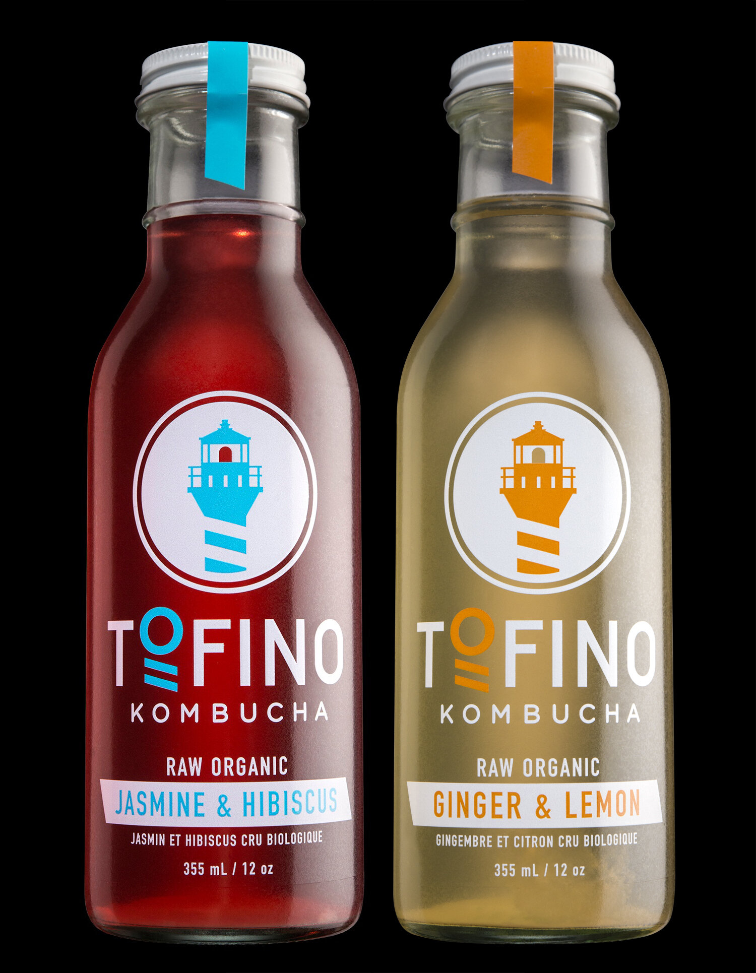
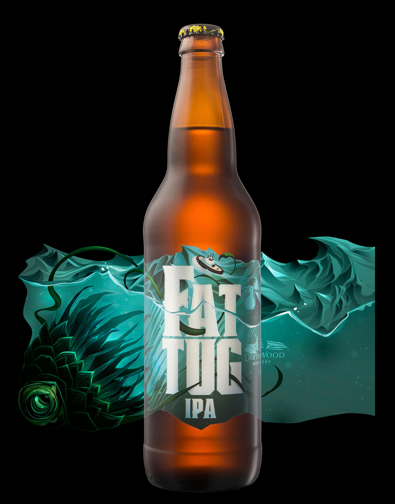
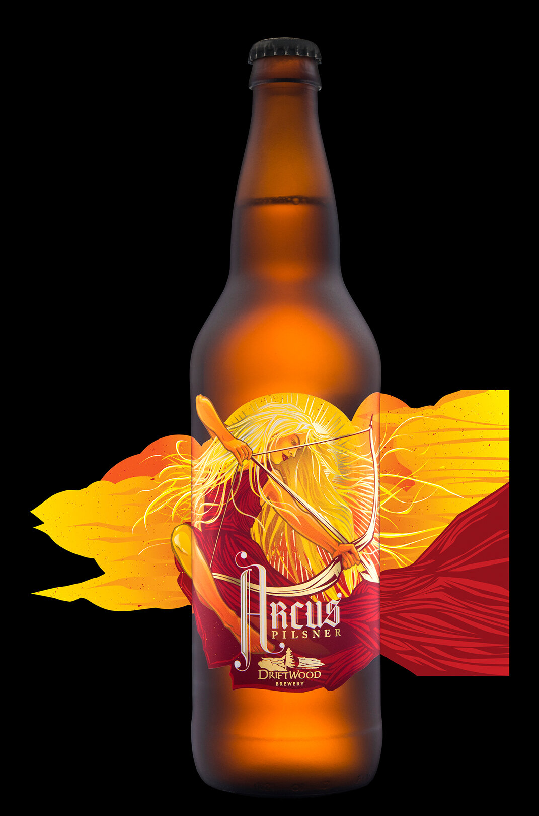
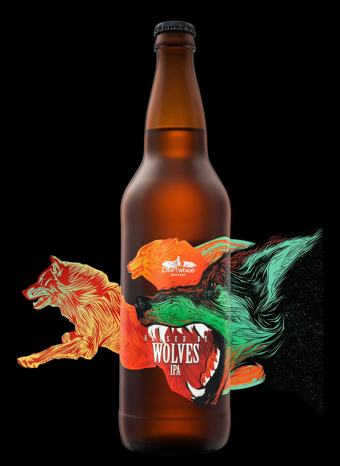
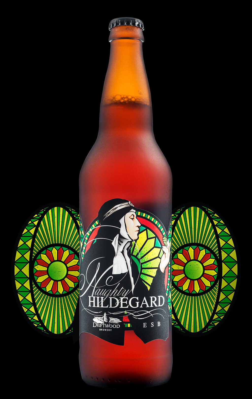
In the middle of the spectrum we see the HYBRID approach, where some portions of the packaging design are made into a template and kept consistent across the entire lineup and the remaining portions of the design are customized for each product.

This is a happy medium for many breweries because it creates some opportunities for Brand Blocking (important for building up a new brewery brand!) while still allowing the personality of each liquid to shine through via the customized design/illustration portion of its label. It’s not as quick/easy/cheap as the TEMPLATED approach and it’s not as time consuming/difficult/costly as the FULLY CUSTOM approach.
We like to take it one step farther and break the HYBRID approach down into SIMPLE HYBRID vs. COMPLEX HYBRID approaches.

In both approaches the layout of the packaging design remains consistent across multiple products. The difference comes down to the amount of customization: custom illustration and/or custom typography and/or custom colour schemes. It’s a bit squishy. There’s no hard & fast line where you move from SIMPLE to COMPLEX HYBRID. Mostly, it’s an attempt to recognize that there’s a big difference between a design system where all you have to do is swap out the illustration of a single ingredient is a lot different than one that requires a detailed illustration that wraps the full can. While both are technically Hybrid approaches, one of them’s going to cost more and take longer.
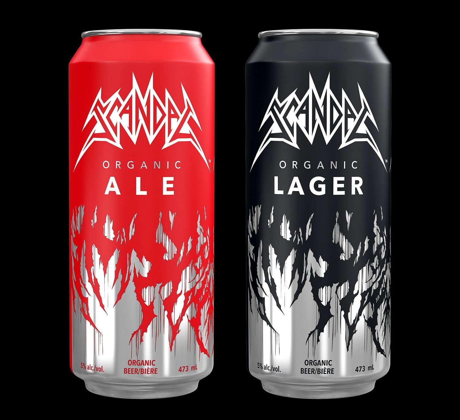
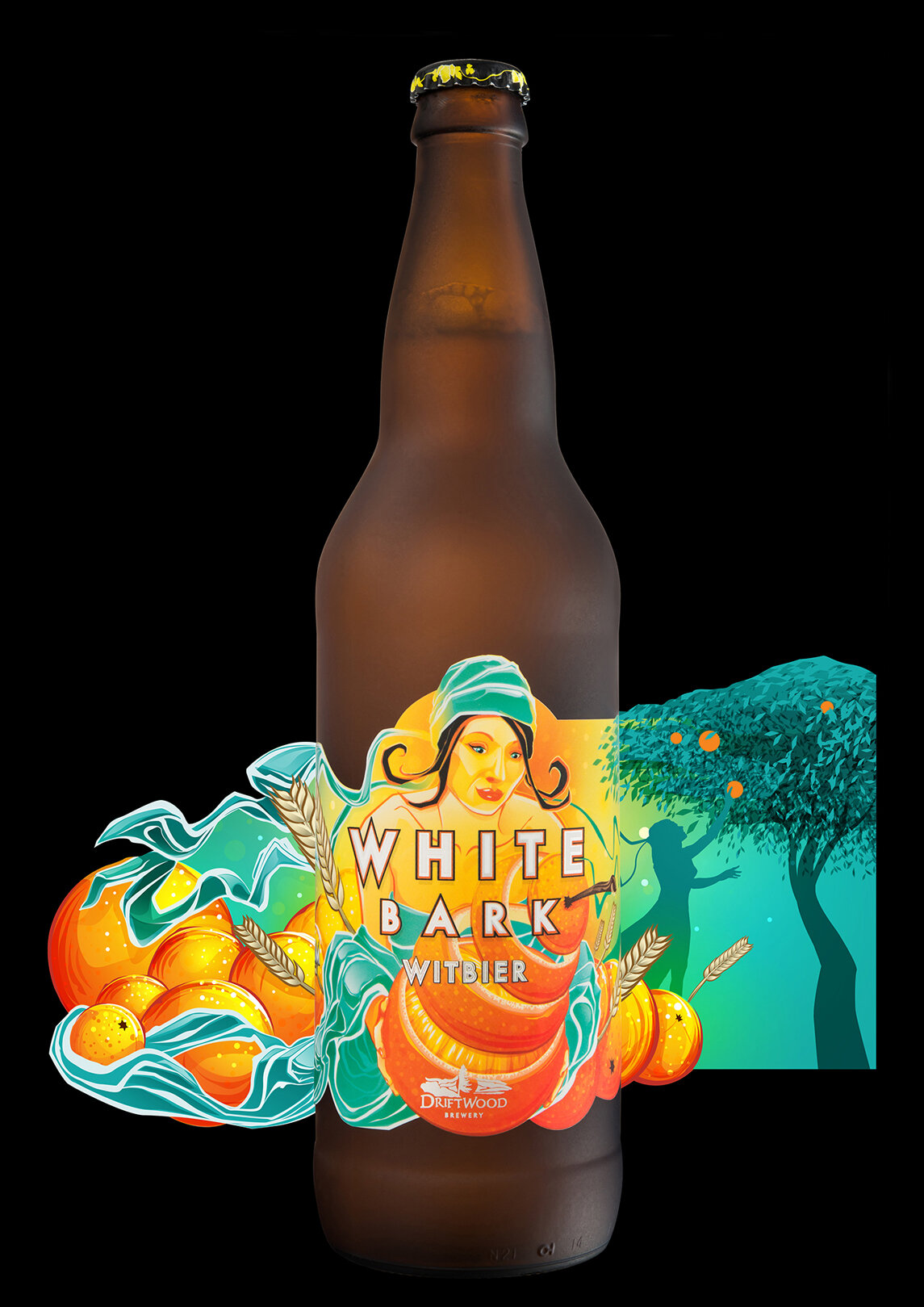
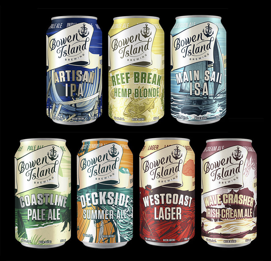
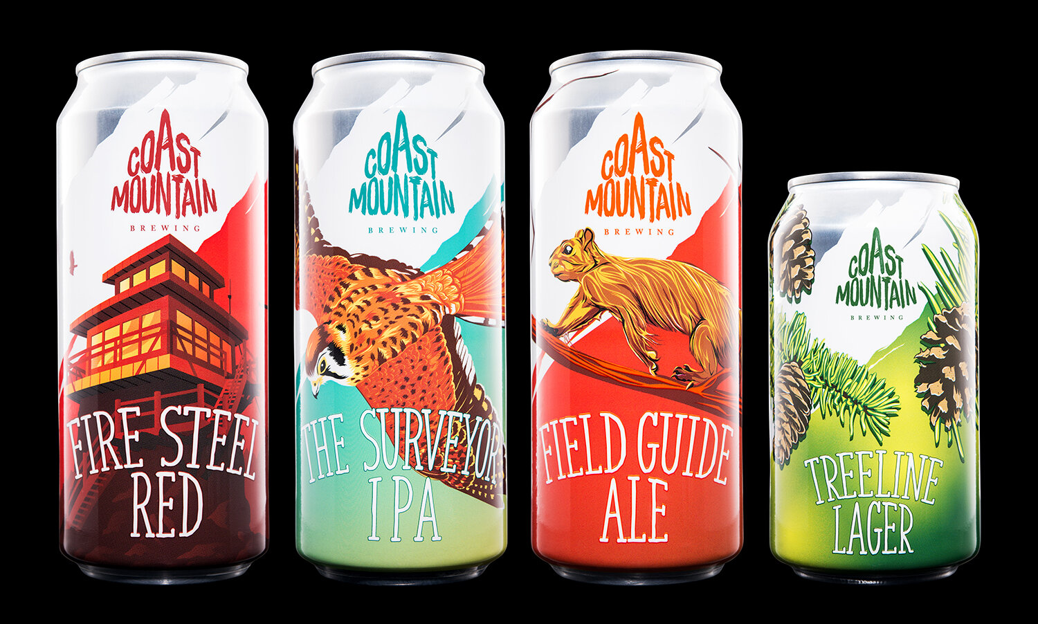
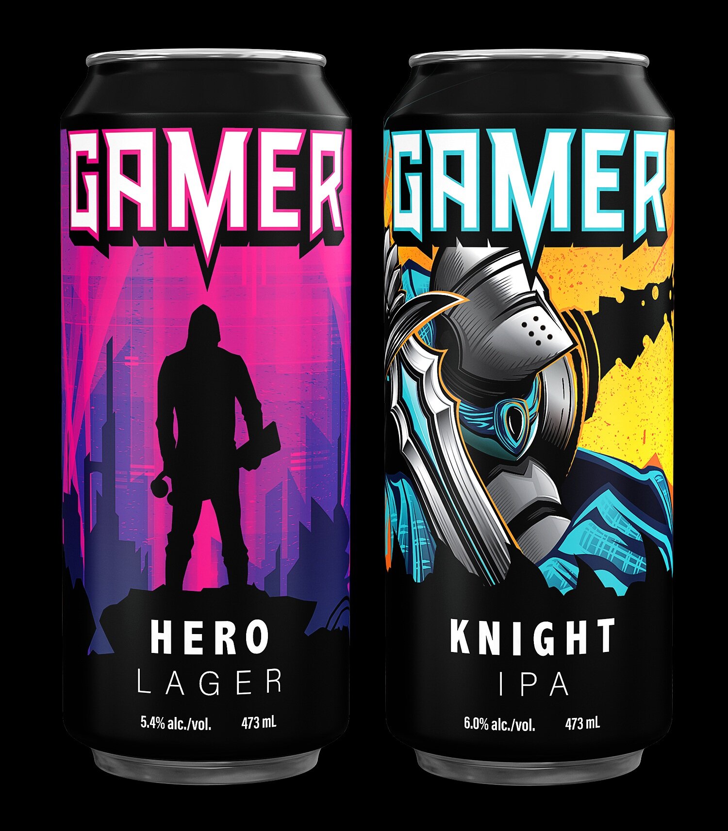
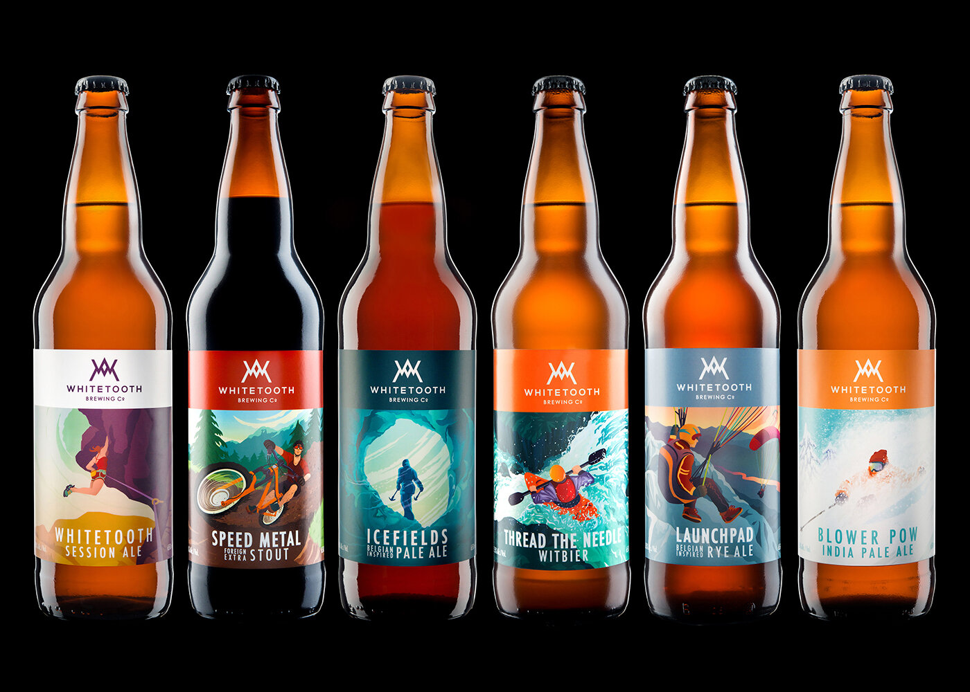
SIMPLE HYBRID Approach:
consistent layout
consistent typography
unique accent colour for each product
custom illustrations
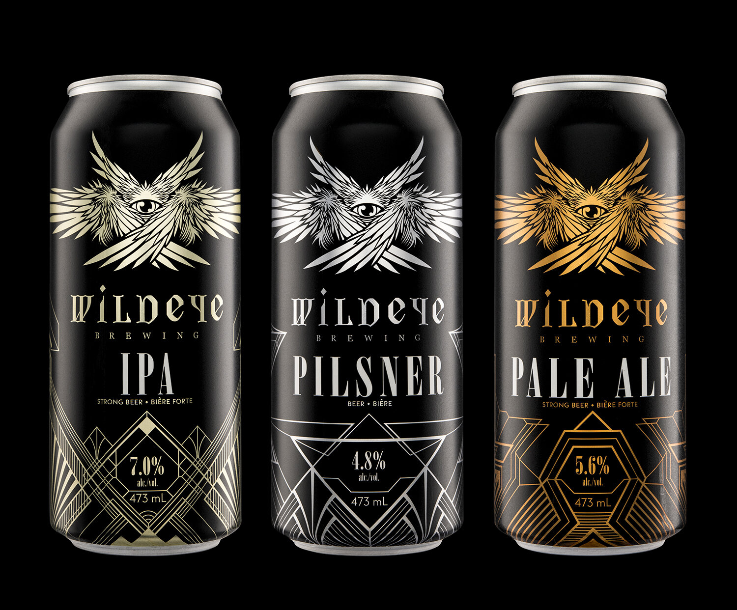
(Click any of the images to see the full project.)
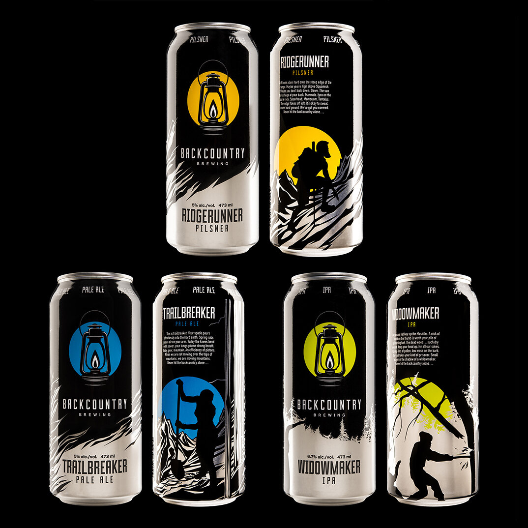
COMPLEX HYBRID Approach:
consistent layout
typography can be consistent or custom for each product
colour schemes can be consistent or custom for each product
illustrations are usually custom for each product
consistent die-cut label shape
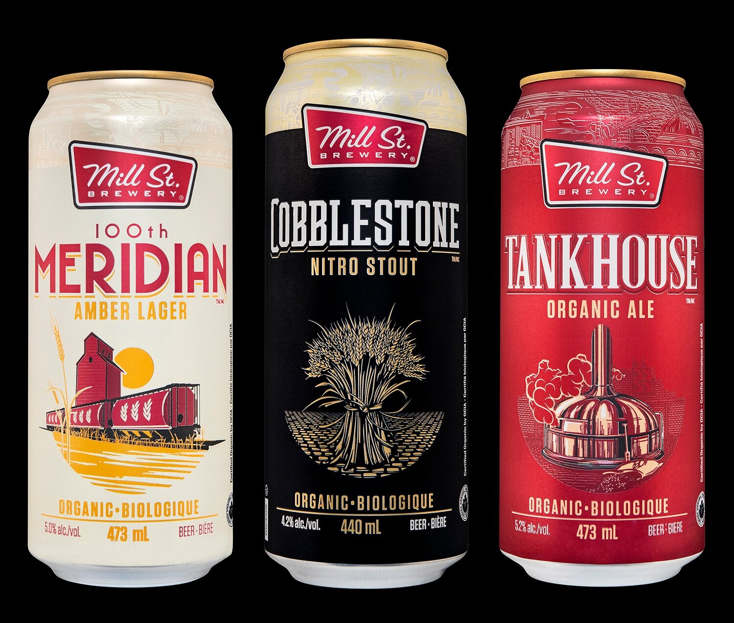
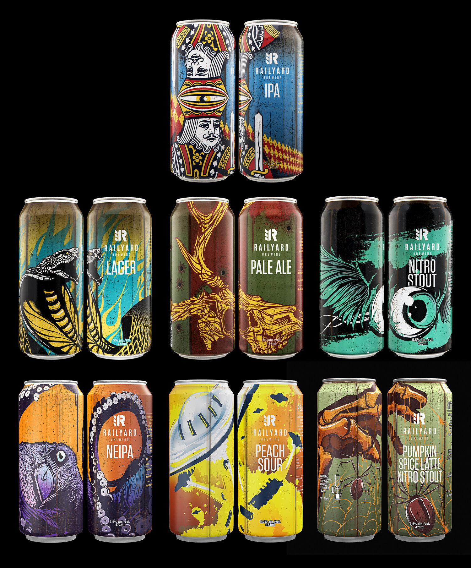
(Click any of the images to see the full project.)
When considering which approach you want to employ for your packaging be sure take a look around at how your competitors are approaching this problem. Some breweries use multiple approaches: FULLY CUSTOM labels for their core beers and a RIGID TEMPLATE for their small-batch releases. Others use the same approach multiple times for each of their product tiers (i.e. different template designs for each of their three tiers.)
Download the four approaches to brand architecture in one easy reference image.
If you’d like to discuss your brewery’s brand architecture, please get in touch.